Design Director, Apegroup
Work from 2014 until 2018
I led the visual design and UX work on selected client projects. I'm responsible for the design strategy, concepts and execution for all projects for my clients. Together with a Technical Director and a Business Director I'm also responsible for new business, expanding our clients as well as setting and reporting to an annual budget for our client team. My three most notable projects where Fortum New Customer Form - which got nominated in Svenska Designpriset 2017, Söderberg & Partners website and the Doodlespot app - which came runner-up in the Swedish Design Award 2018.
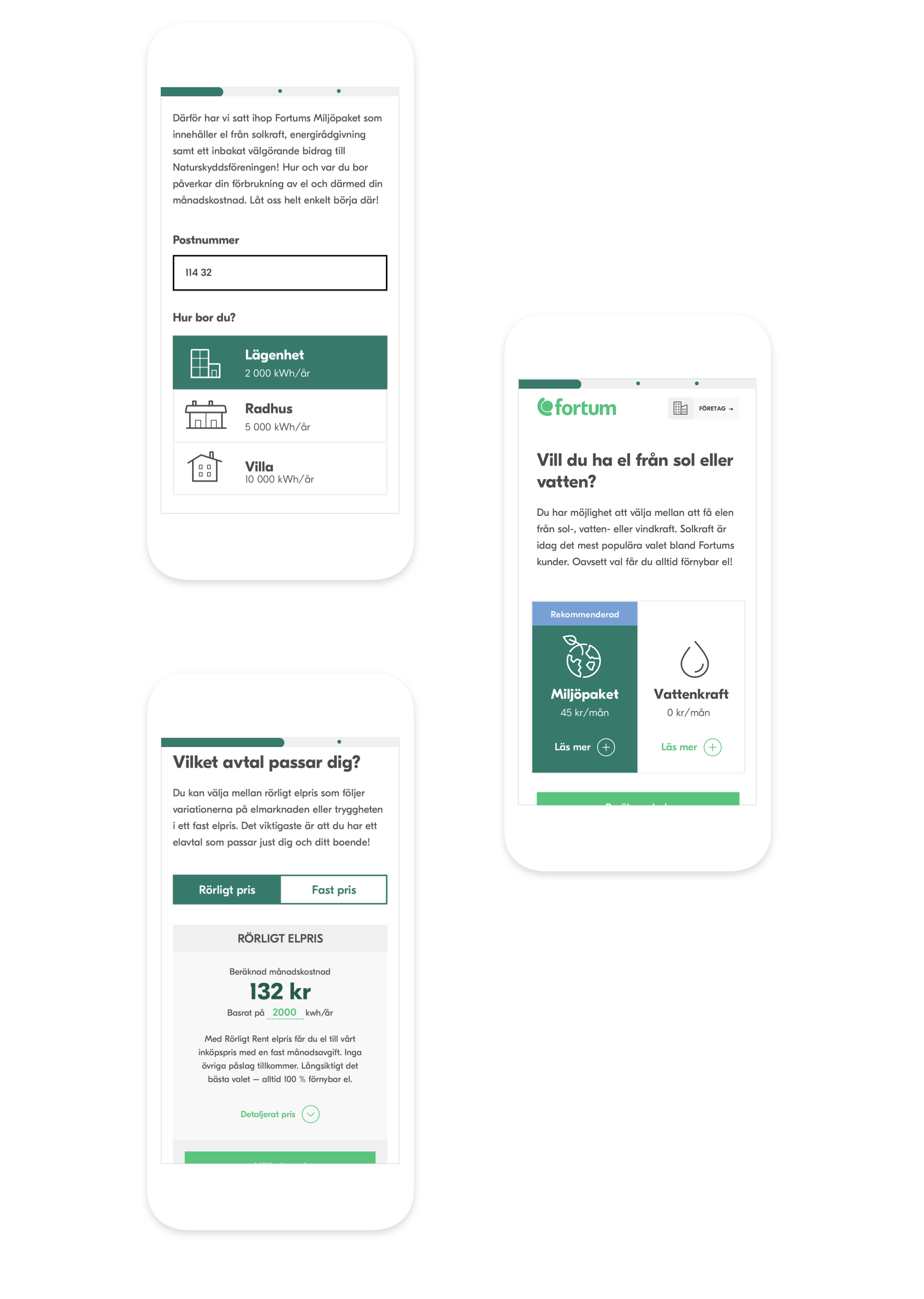
Fortum New User Flow
From soft values to hard results
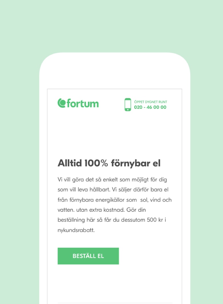
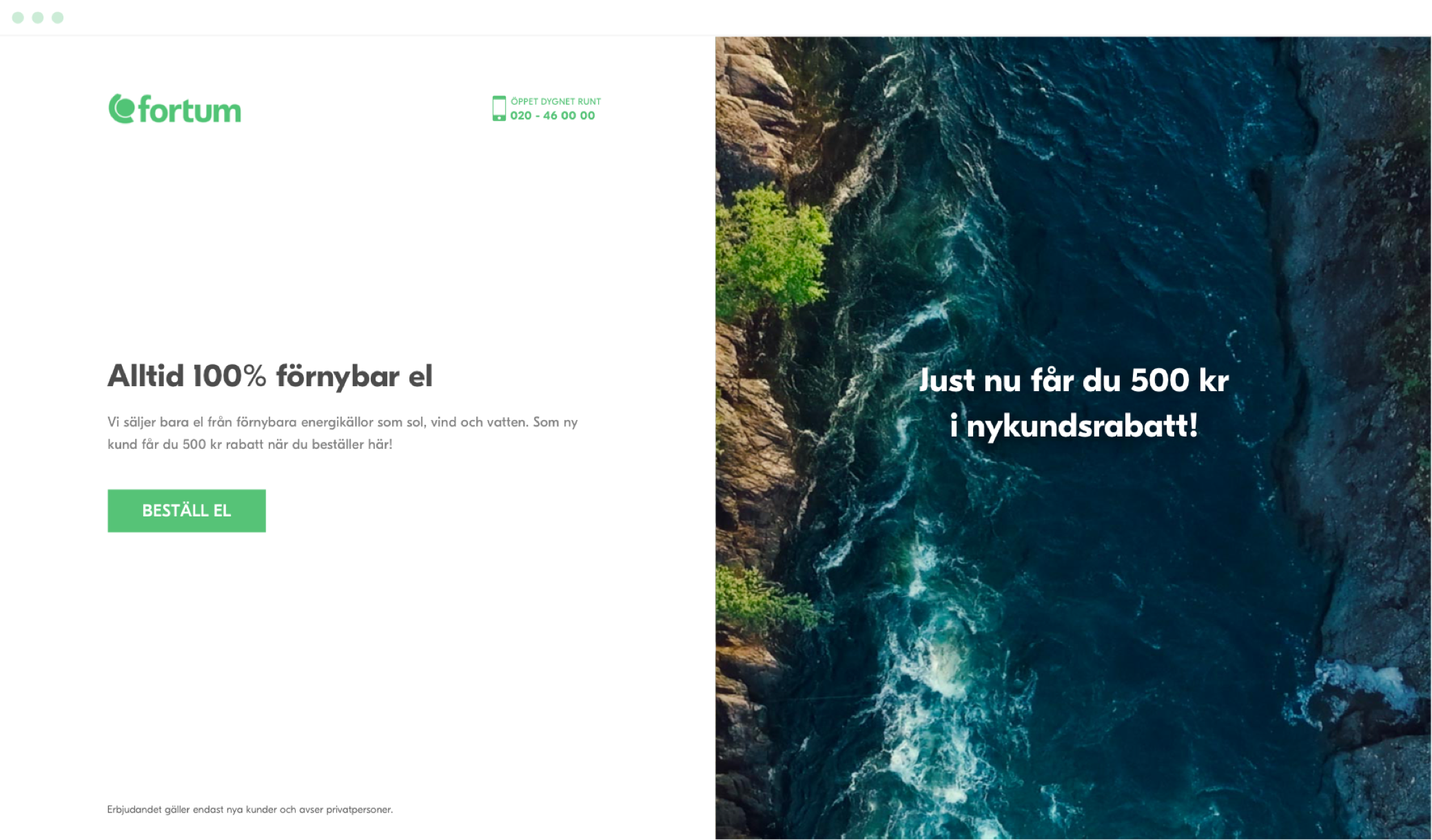
Fortum is one of Sweden’s biggest providers of sustainable and green energy. Fortum tasked us to help them attract new customers by creating a new purchase flow that showcases their commitment to the environment and the unique value they can provide their customers. My role was design lead: responsible for design concept, client contact as well as UX deliverables.
I worked closely together with an Art Director, Front-end developer and a Copywriter on this project.
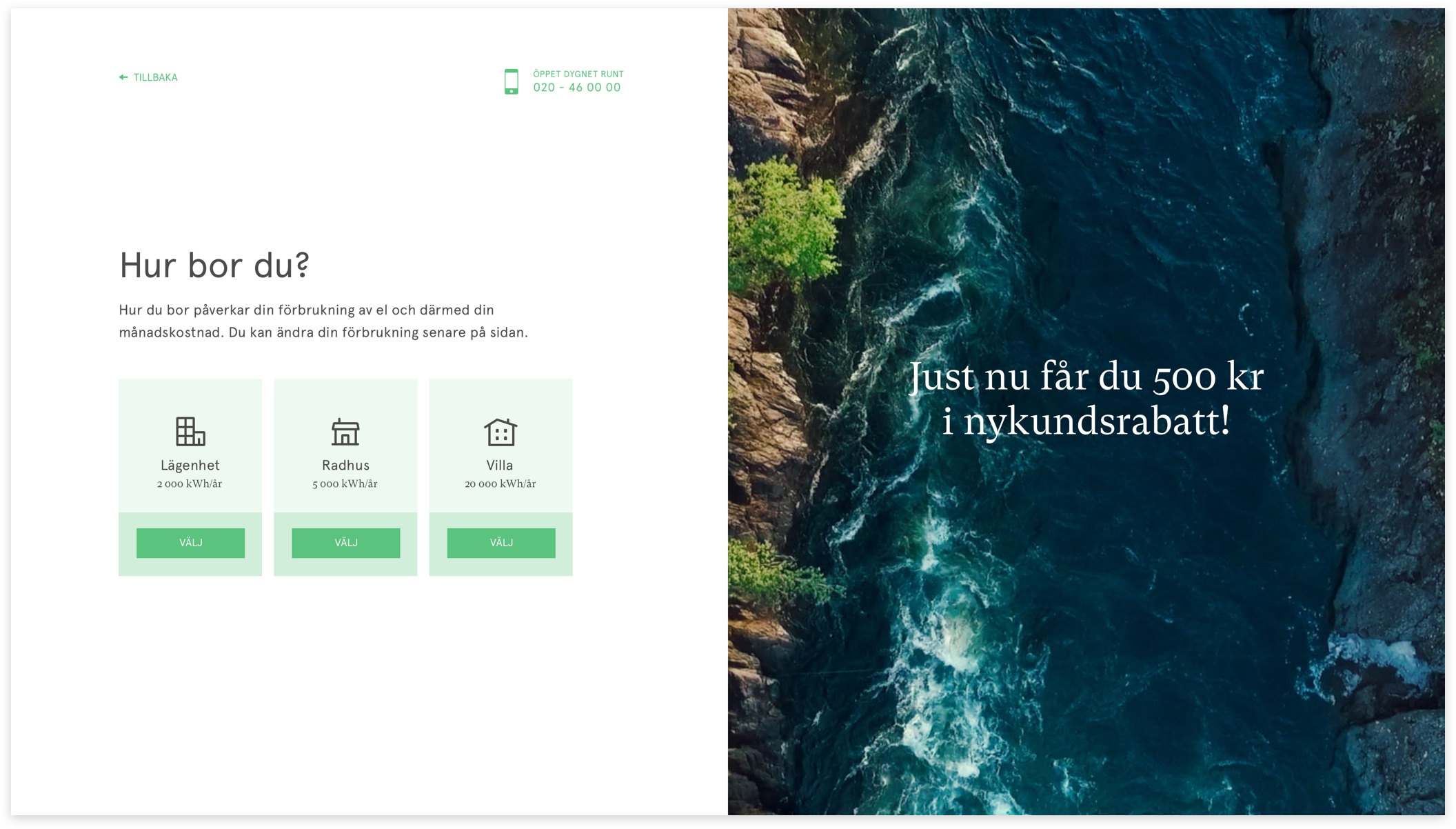
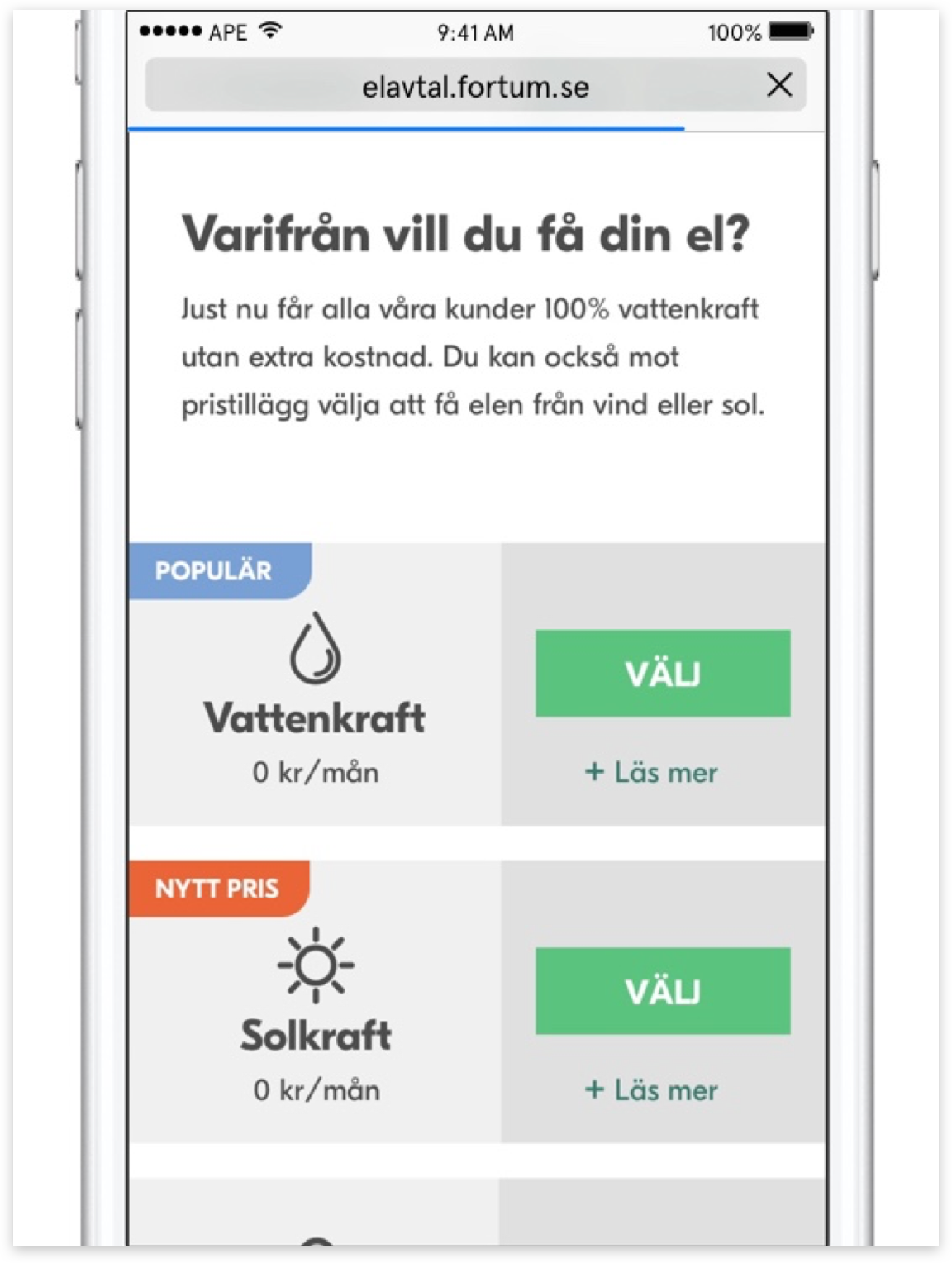
My biggest inspiration for the new purchase flow was Typeform. I wanted a big fullscreen form — with one question at the time and a progress bar at the top. That would set us apart from all other energy companies in Sweden (and the world). The insight we based our design on was that it doesn’t have to be quick like other forms usually have to. You switch energy operators maybe 3-4 times in your life. Instead of fast, we wanted it to be straightforward and fun — with big visuals that talk about the clean energy sources.
To read more visits the case study (designed and written by me) over at Apegroups website https://www.apegroup.com/fortum
See the product in action
Screen recording of product interface
Wind, Water, and Sun
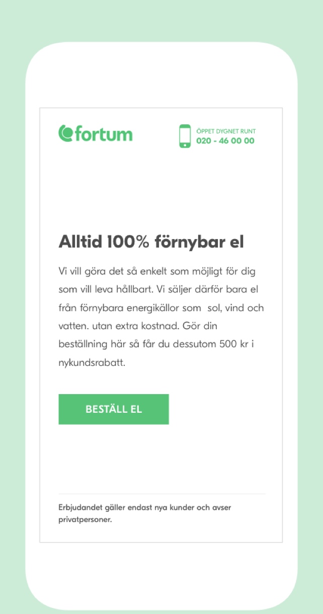
Content played a massive part of this project, as it should for every design. As soon as we got client sign-off on the initial concept of a fullscreen form with one question per screen, we started experimenting with a 50/50 approach where the input was to the left, and the image was to the right. We began with images of water and quickly landed on having additional messaging on top of it. Text that wasn’t pivotal for the experience (small screens and mobile didn’t see the right part) but added to the brand and sometimes helped the user. I came up with having the image change depending on what energy source you chose, and our content team convinced the client that we should add a video. They loved it and sent us to the North of Sweden to film one video for each energy source: sun, wind, water.
Please read the full case study on content and copy work (which I was part of) https://medium.com/apegroup-texts/dumb-it-down-dress-it-well-107ec91e4f55#.8ctbp7f4l
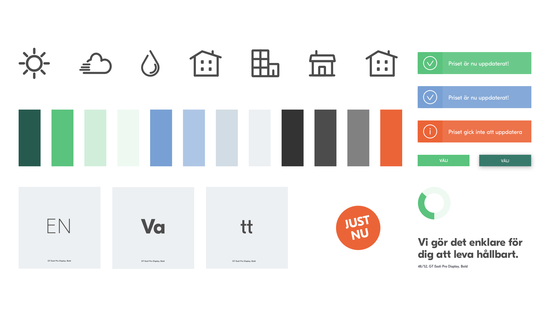
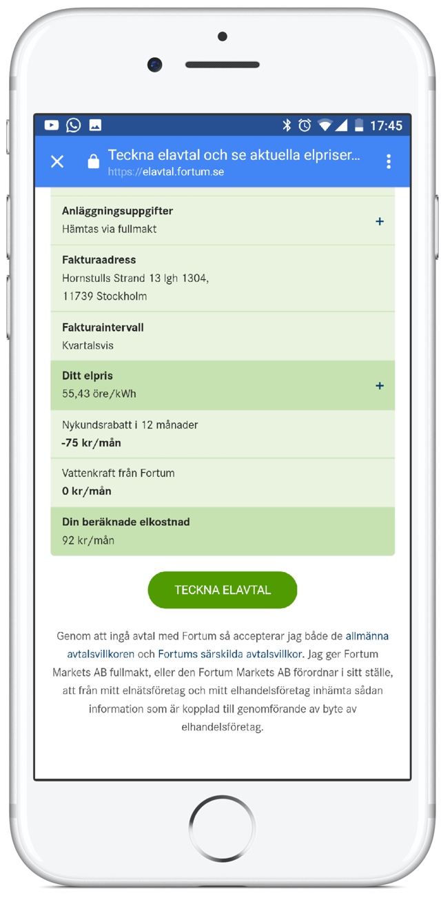
After the launch of the MVP version, we worked continually with the Fortum team to improve and expand on the product. Two things to notice: initially our front-end developer built the product so that it was too fast; many of the loaders you see are fake to give the customer the feeling that we are reading in real-time data. Initial user tests showed that a lightning-fast product was hard to understand and not easy to trust.
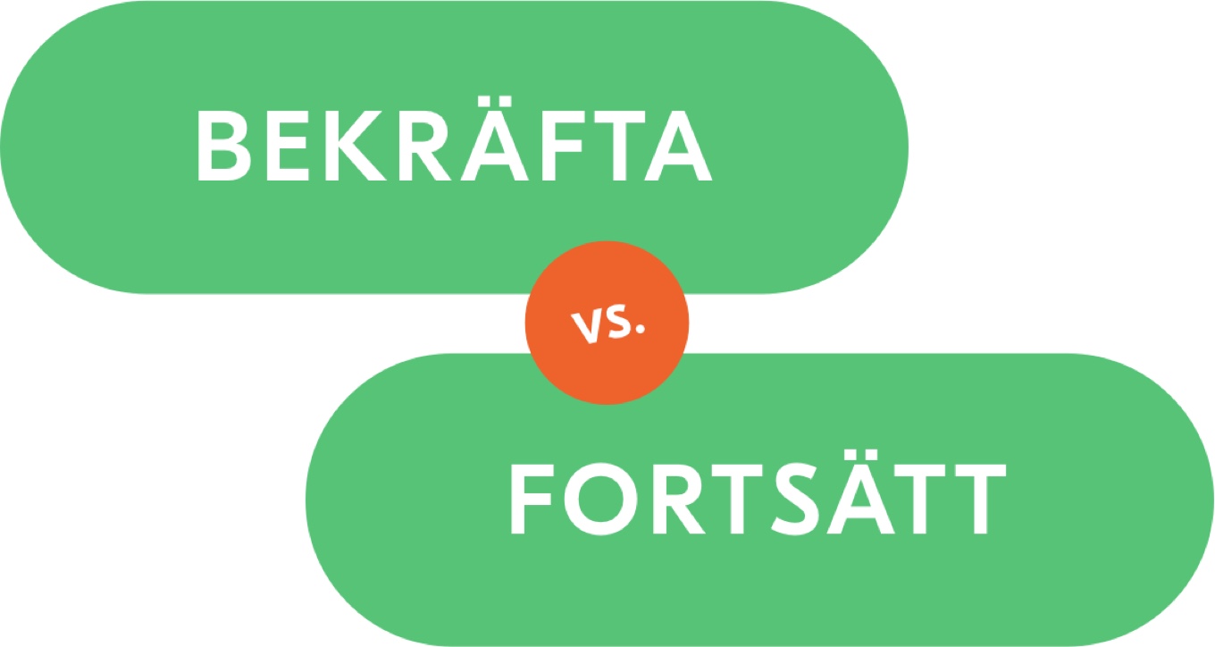
We worked a lot with small changes to nudge the metrics. For instance, when we noticed a high drop-off on a particular screen, we tried changing some little things, and A/B tested it. By changing just the word on the “Next” button — from “Confirm” to “Continue” we saw conversion rise nine percentage points.
This project was nominated for the Swedish Design Award 2018.
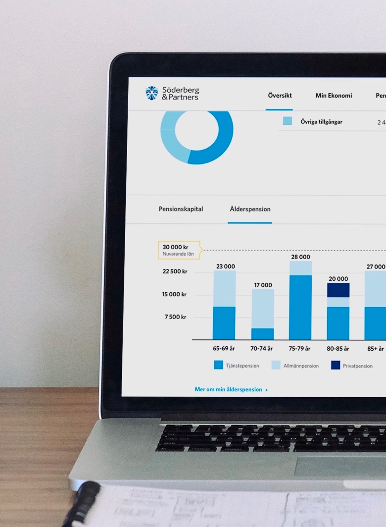
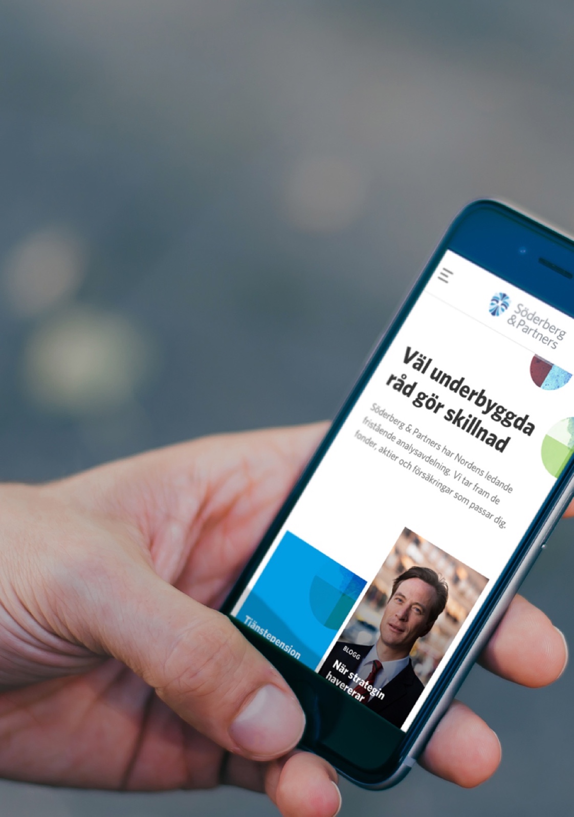
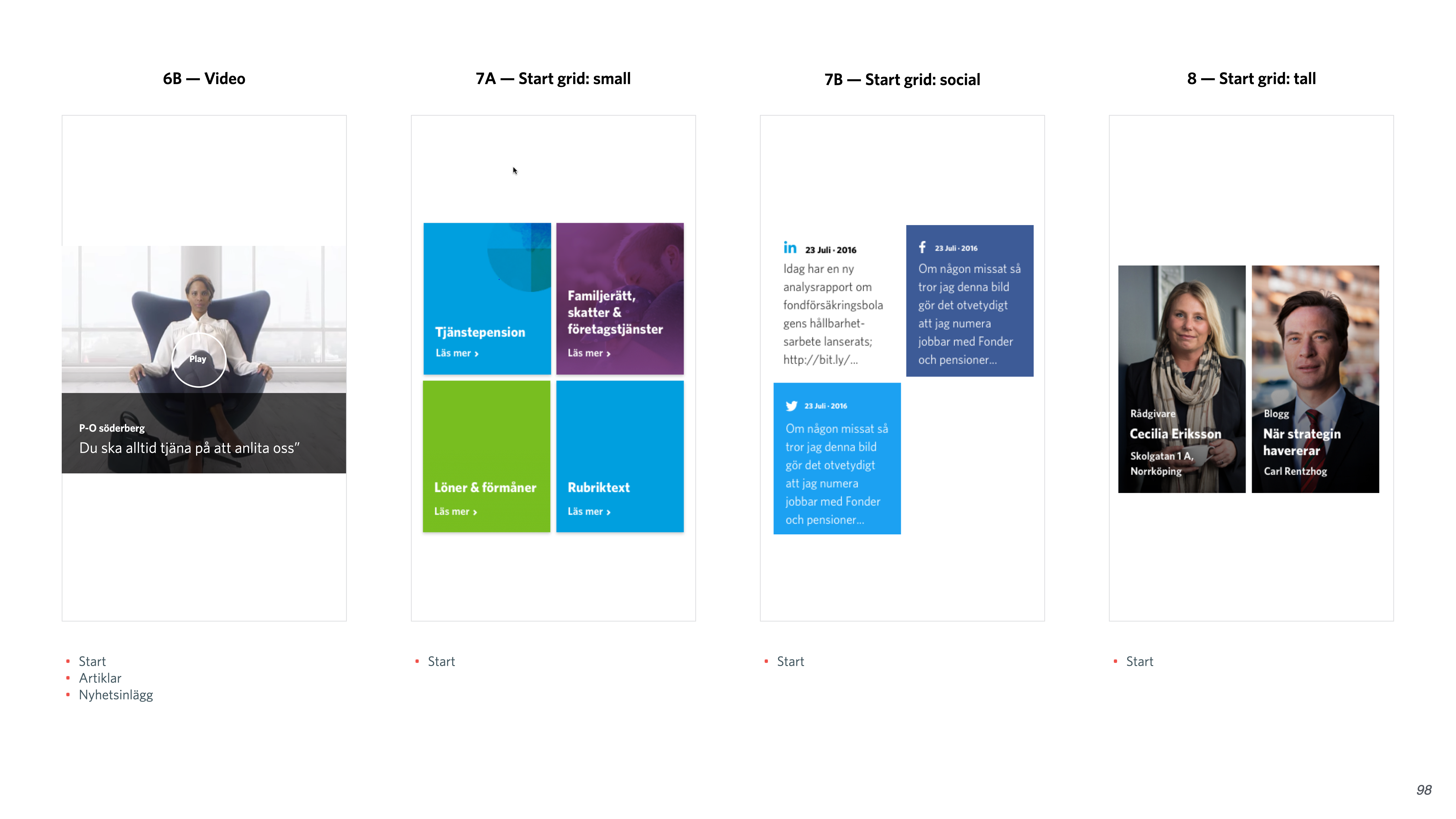
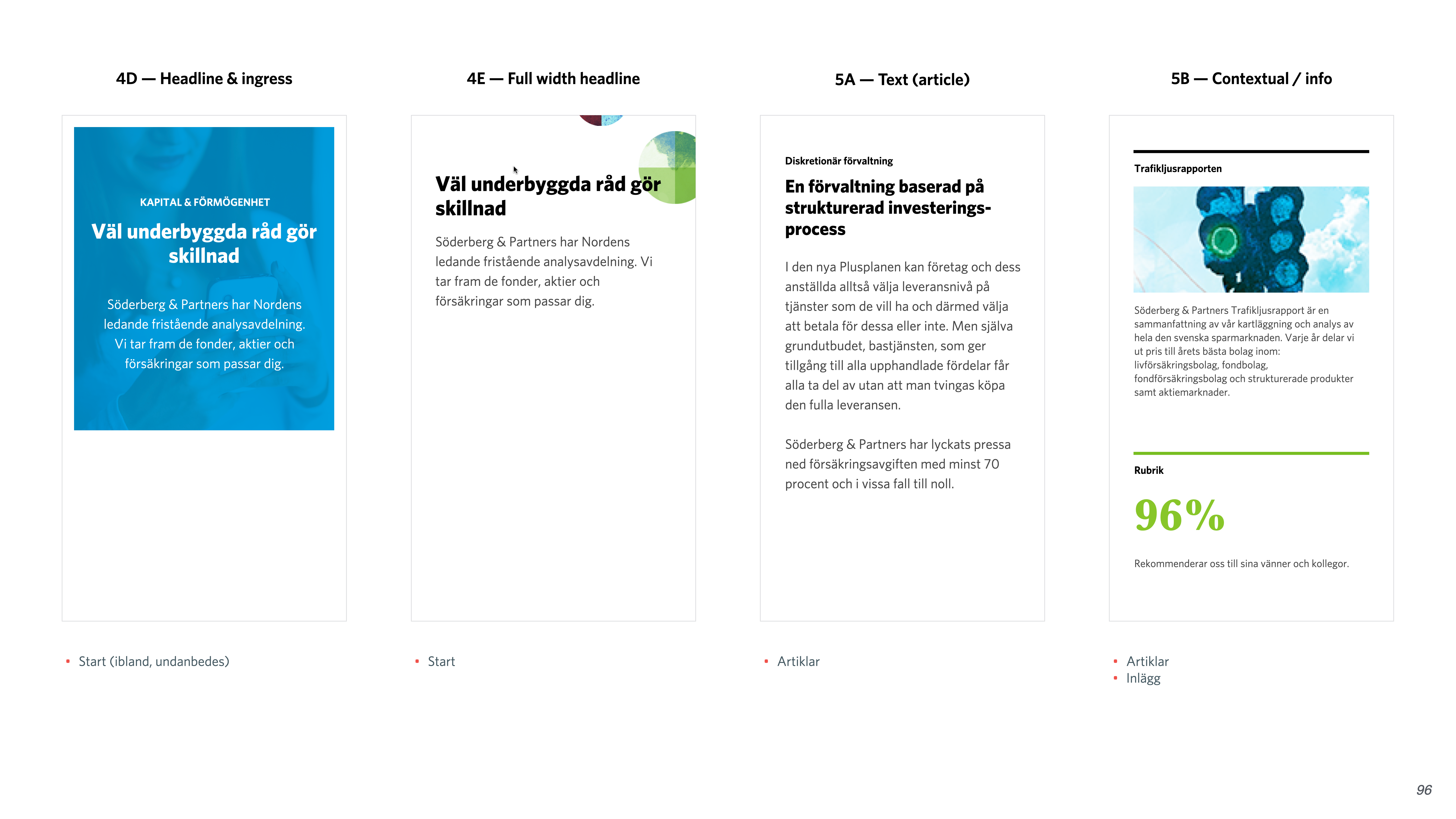
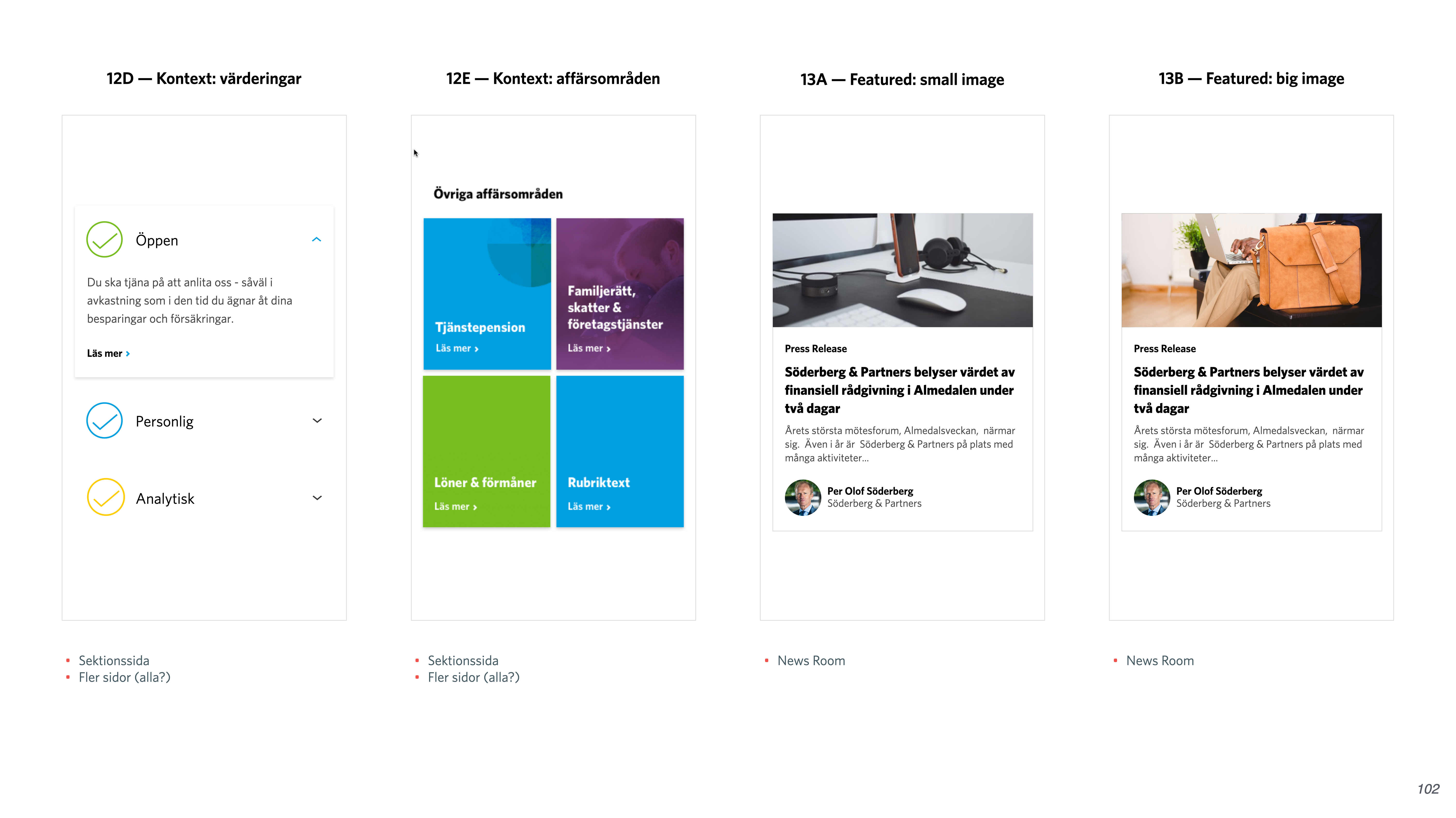
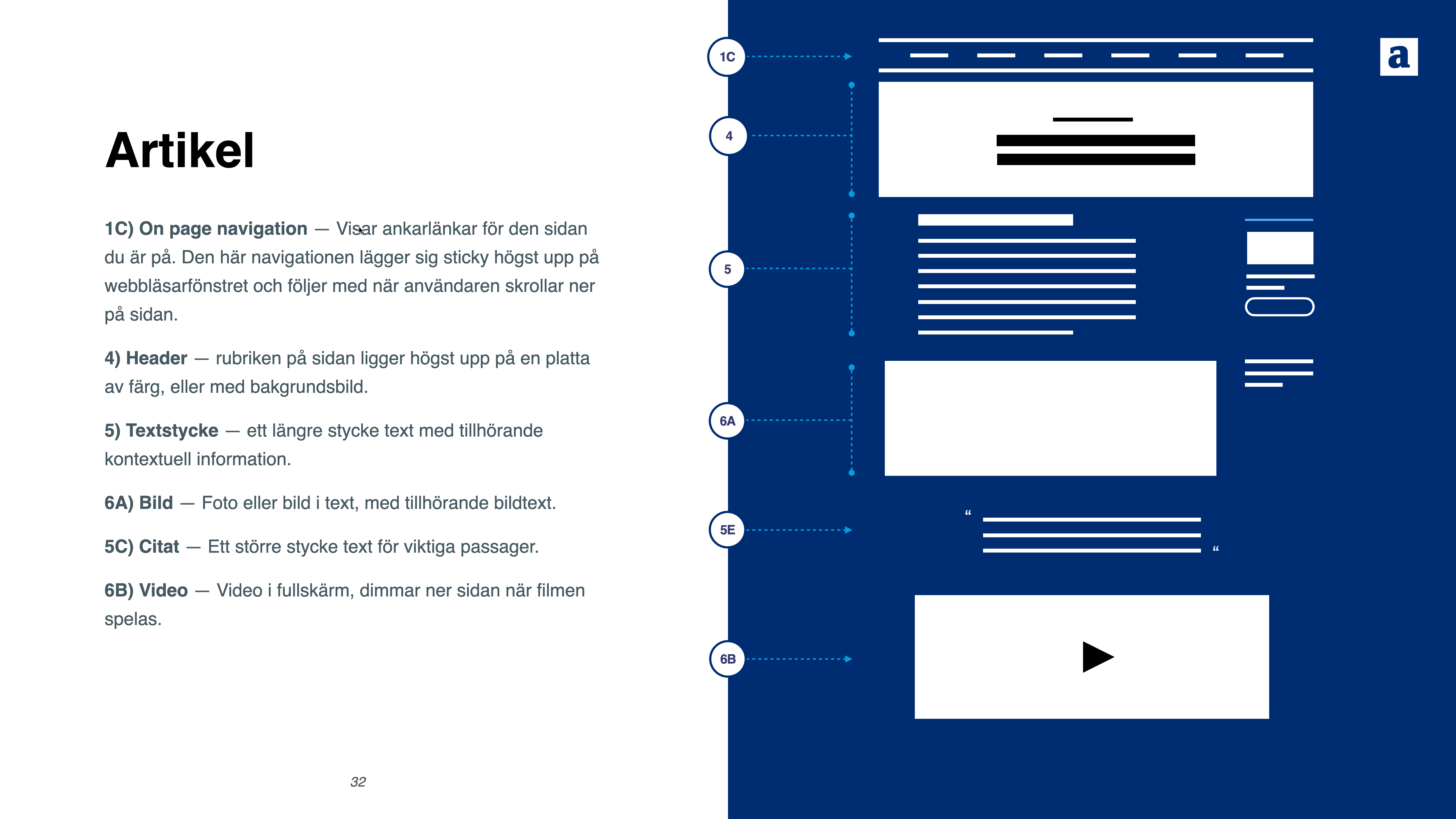
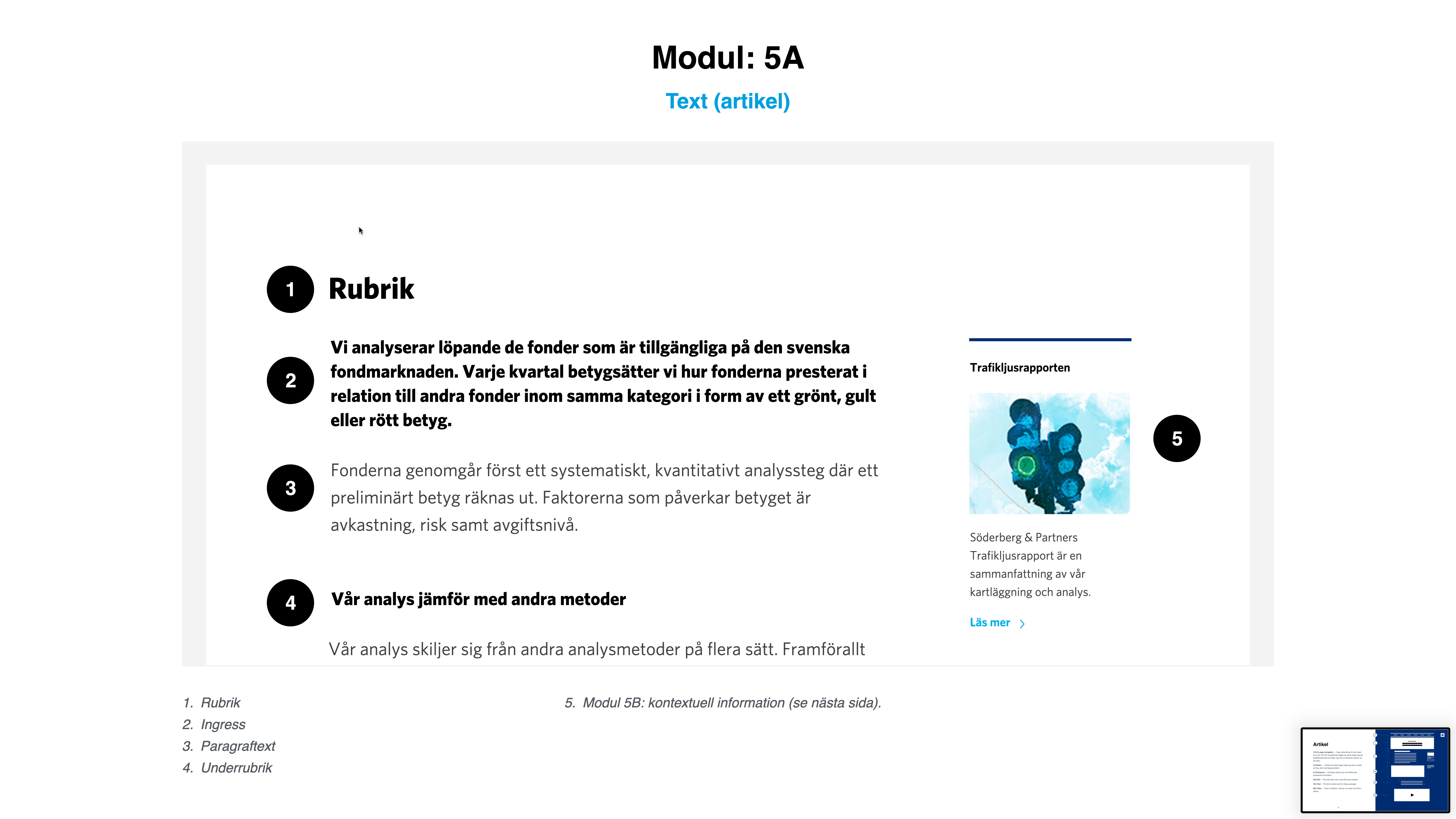
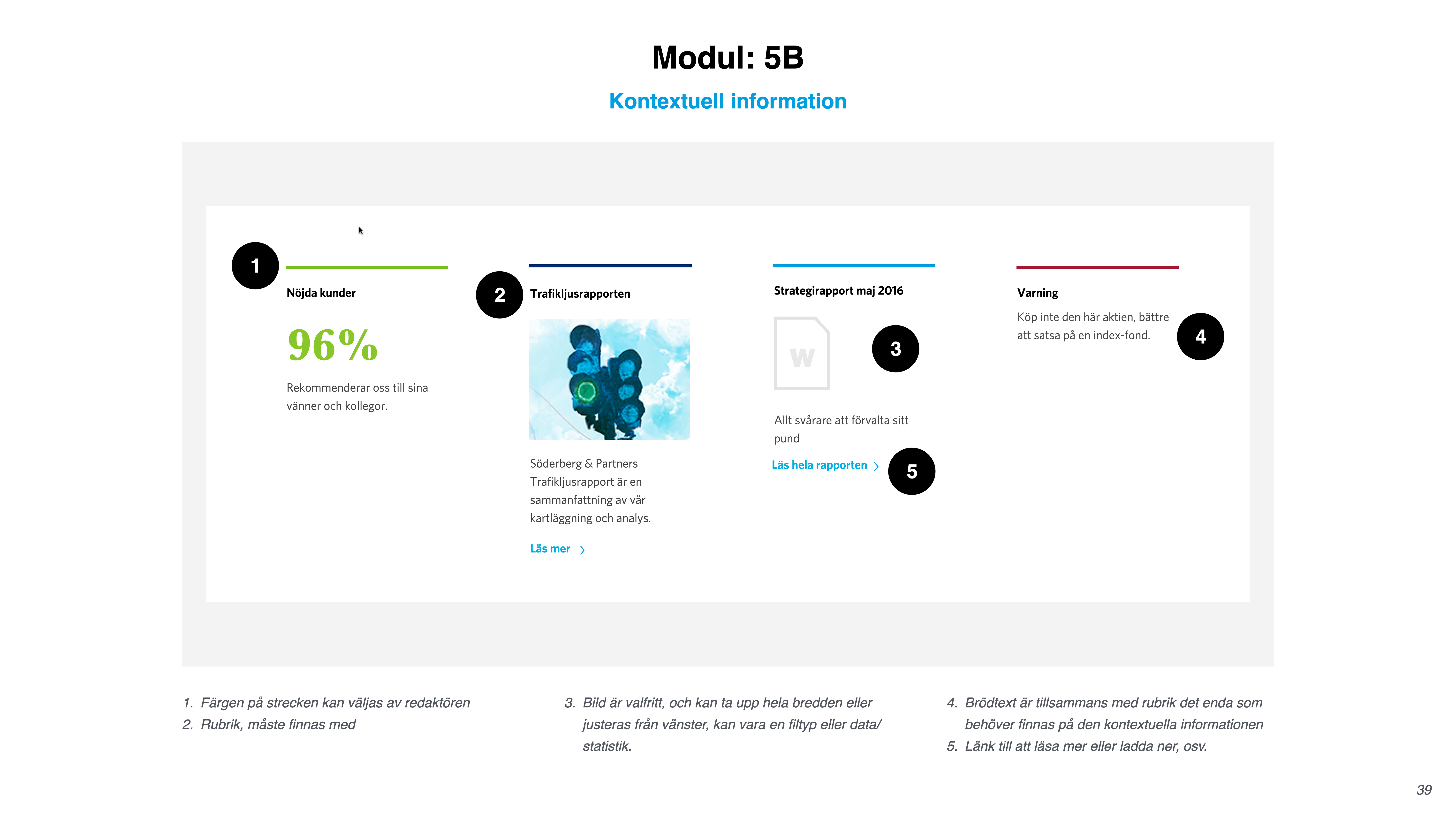
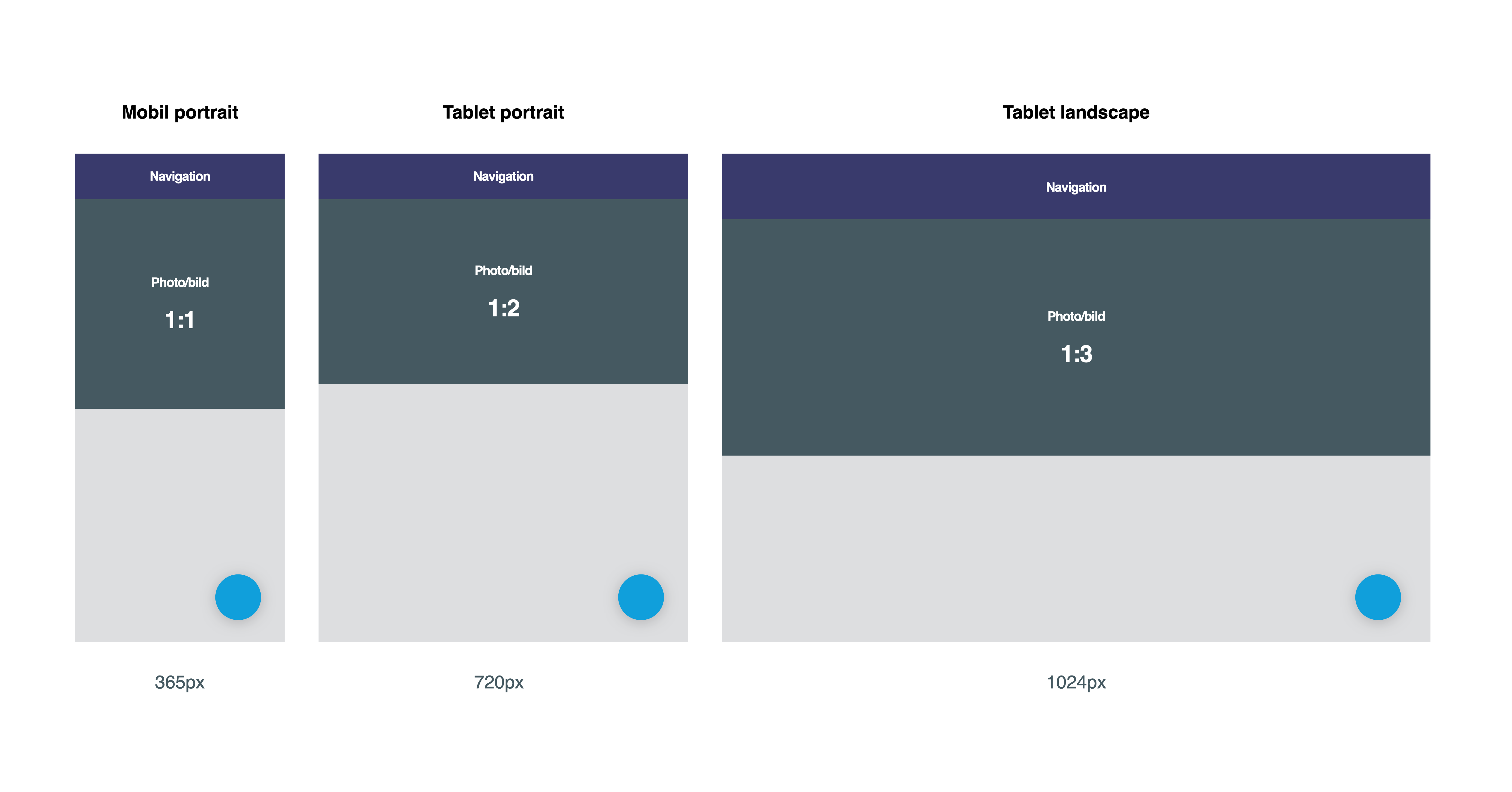
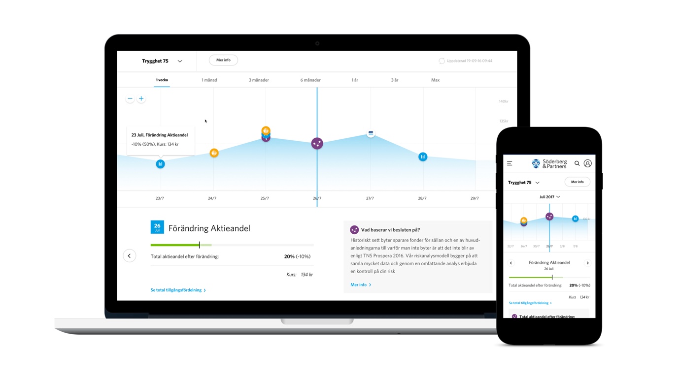
Söderberg & Partners is one of Sweden's primary private financial advisor firms, offering several services including wealth management, personal pension and company insurances. They came to Apegroup with an ask to modernise their digital products — which resulted in a new external website, an updated logged in service and a design system to tie them both together. The team consisted of me as Design Director, together with an Art Director and a UX-designer.
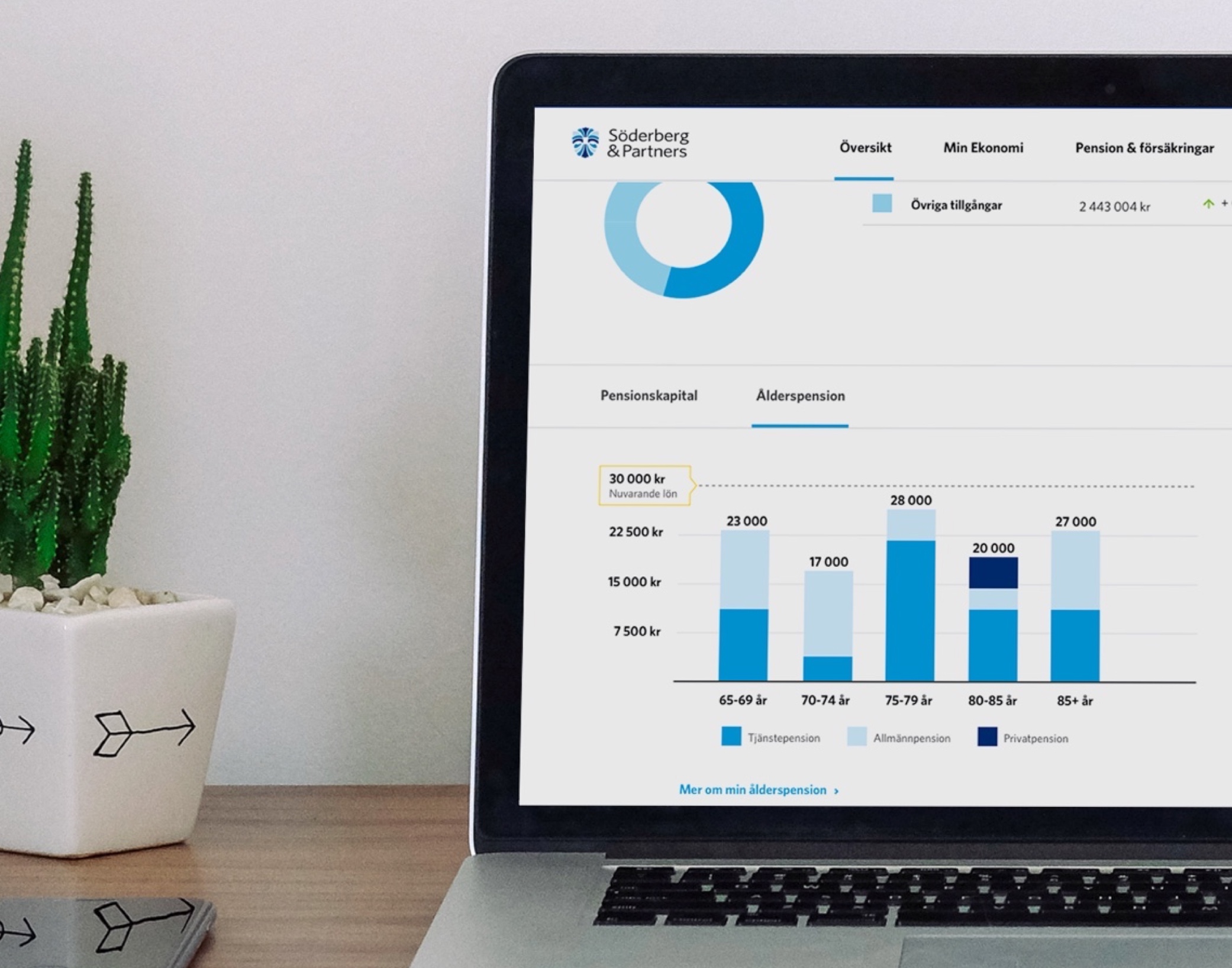
While working closely with the client, we were not able to meet the developers of either website or internal service until after we had finished our design. That put a lot of responsibility on us to deliver a robust design system without any loose ends. This was before design systems were all the rage (we called it component library back then). Basically, we rushed through the wireframe and key screen designs, to have as much time as possible to focus on refining the system and the components. Then we backwards engineered the visual screens at the end and updated them with the new and improved components. Thankfully it all came together nicely in the final days of the project. It is still used (with minor updates) today, three years later.
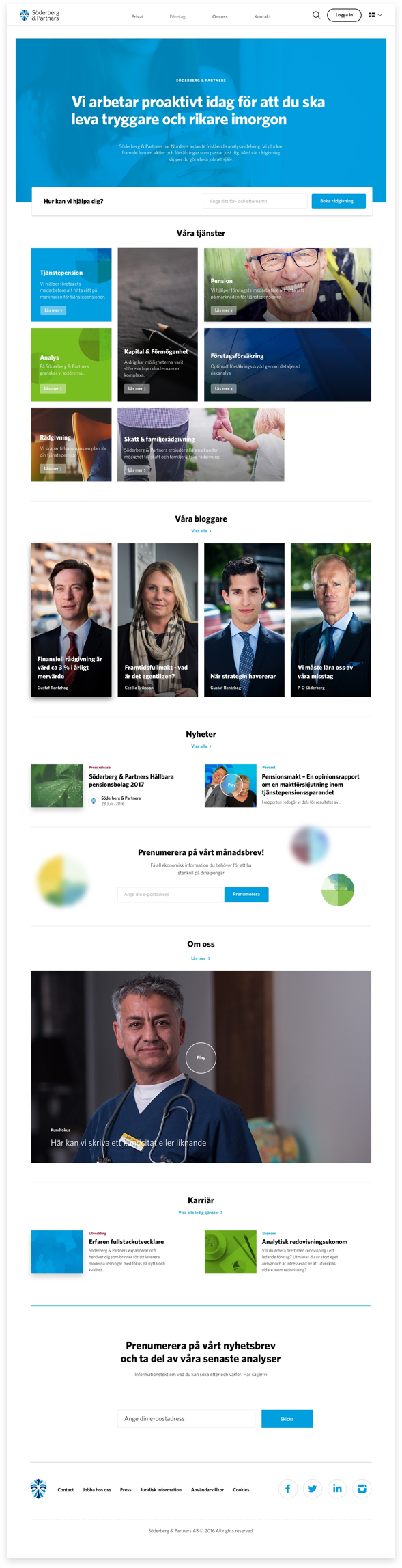
New 'Home' page of soderbergpartners.se
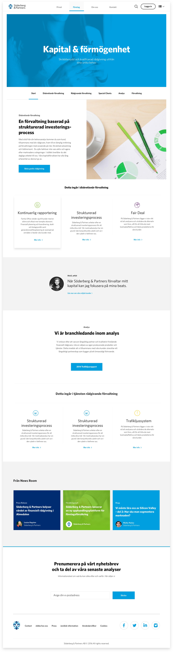
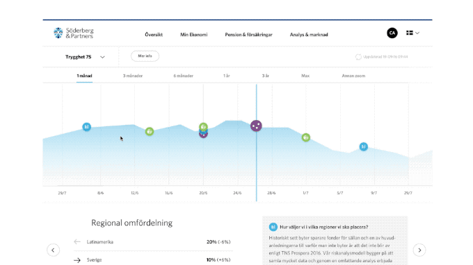
New 'Business Area' page template of soderbergpartners.se
Websites come alive with good content. Unfortunately, we were handed a pretty outdated brand manual and some curated stock photos to use at the beginning of the project. We knew they were interested in informational videos, so we added a big video module to early designs, and pitched ourselves for making the videos. I tagged along with our video crew and acted as design director and sound man for the recording sessions at their office.
Söderberg & Partners Website case video
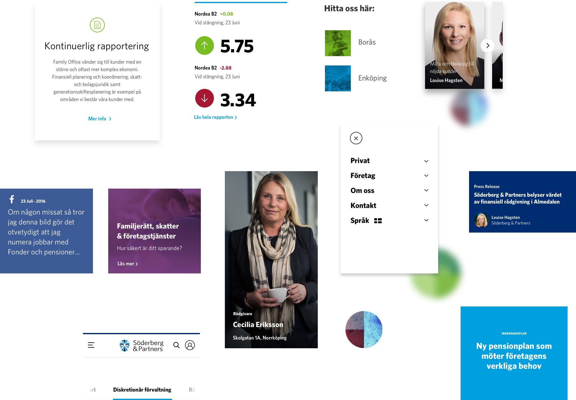
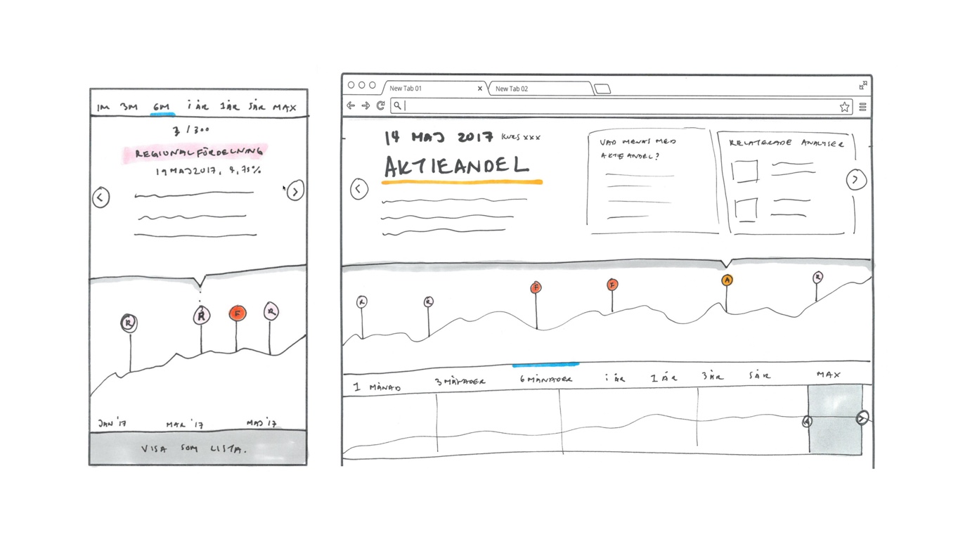
I worked on several projects for different departments across Söderberg & Partners — too much to show. And to be honest, most of it was quite dull update-your-expenses-stuff. We did this nifty little timeline for the Asset Management team that I'm quite proud of.
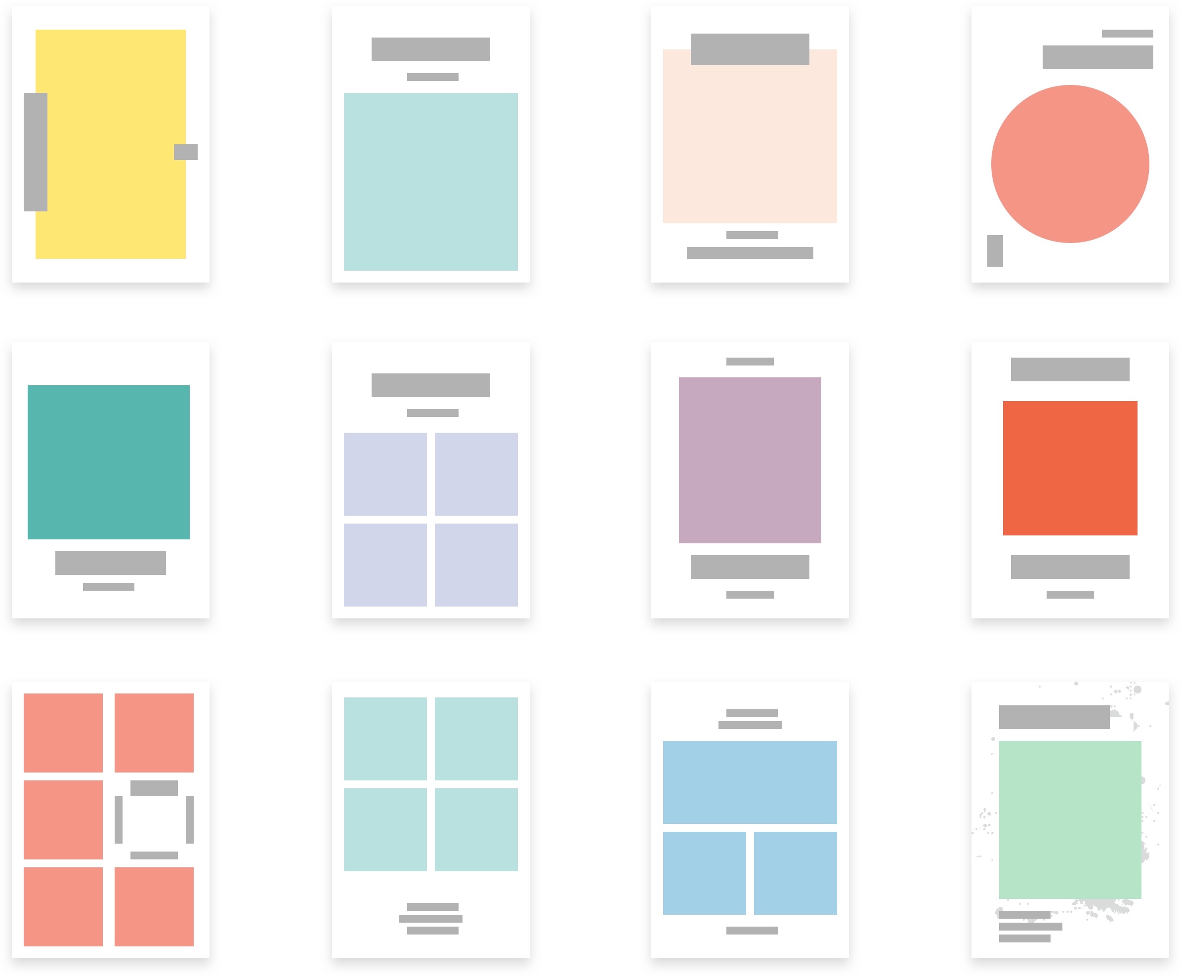
Wireframes
Visuals
Prototype
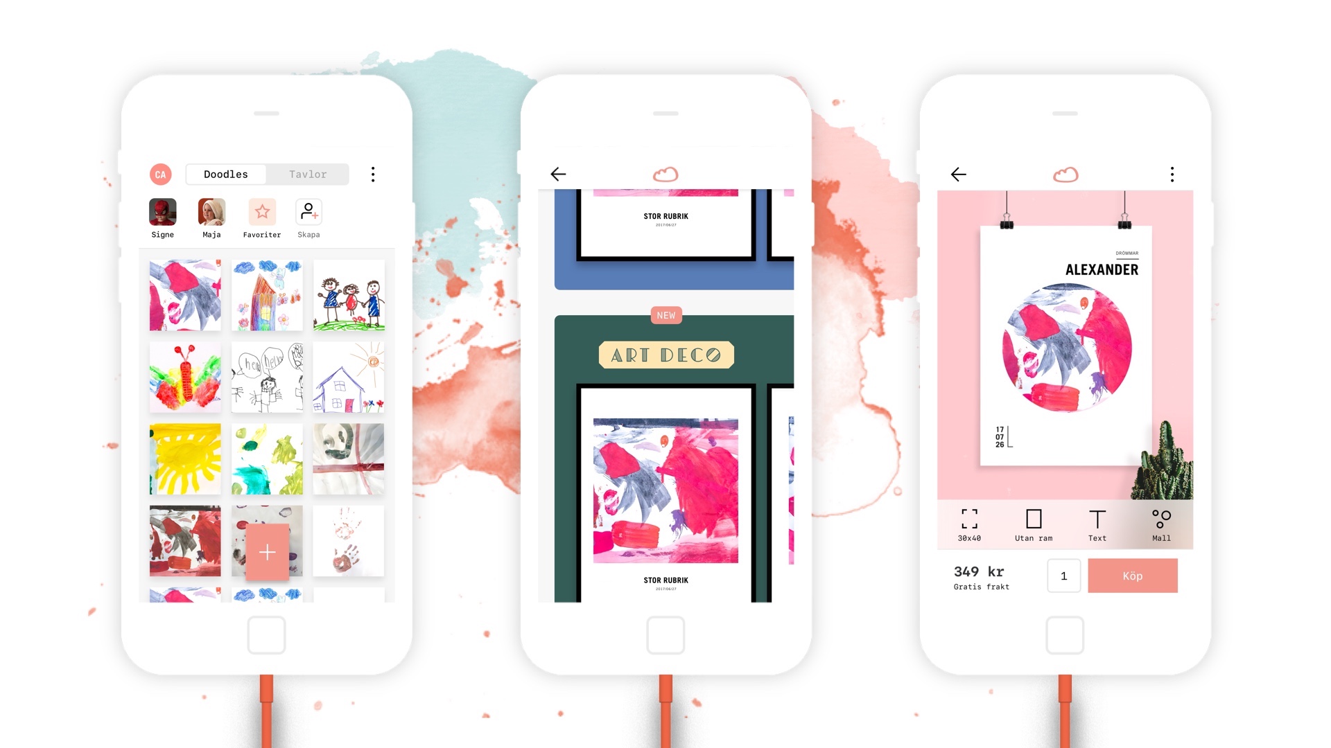
Like so many other parents, the two founders of Doodlespot kept stacks after stacks of drawings up in the attic collecting dust. Just a selected few made their way to the refrigerator door, while the rest were forgotten. Doodlespots idea is simple: to save all your children's fantastic doodles digitally and turn some of them into incredible artworks to hang on the wall. The goal was crystal clear, but the road how to get there wasn't.
My official role was UX designer on this project, responsible for wireframes, prototypes and user testing. In reality, I did mostly product strategy and advisory, while worked together with the Art Director, doing everything together, in tandem.
The biggest problem for agencies working with start-ups is that we all want to make so much, but there are very little money and time to work with. Our solution was very pragmatic: keep our team to only two people and only do the bare minimum — whatever gives the most bang for the bucks. We proceeded to give them what they needed, not necessarily what they wanted. The first small project turned into a year-long, thriving collaboration.
The Art Director and I skipped every design deliverable on the way and designed an MVP prototype in InVision in just 2 days. Then we proceeded to create the pitch video — because the first thing they needed was an investment, not product design. Two weeks later, they took a compelling product video together with a high-level pitch deck to investors and secured enough money to build the first version of the app. With that money we made a simple but useful app that did one thing very well: take a photo of drawing > turn into artwork > order for print. There were hundreds of ideas that we scrapped along the way, distilling the core experience down to only the essentials.
Doodlespot pitch video
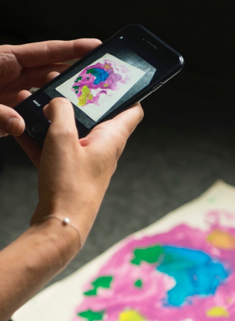
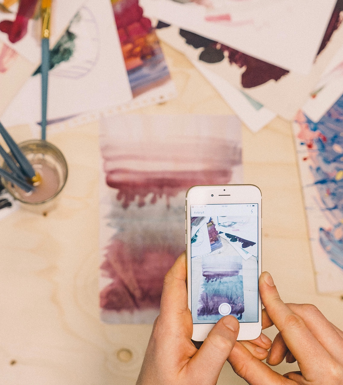
1. Take a picture
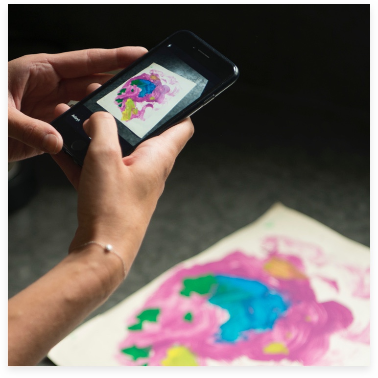
2. Create magic
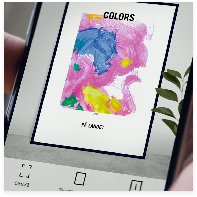
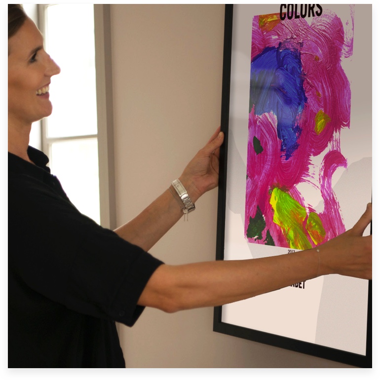
3. Hang on wall
Doodlespot UI screen recording
Some months after the launch of the first version, with sales figures looking very promising, we designed and built the second version: including more artwork templates, an onboarding and an improved camera experience (with filters). We created a small brand book, and component library and advised them to start hiring some developers on their own for future development. The app got an average of 4.8 stars on the App Store, and we were nominated for the Swedish Design Award 2019. The most significant stamp of approval, however, is that the company is still active three years later, and growing.
To read more visits the case study (designed and written by me) over at Apegroups website https://www.apegroup.com/doodlespot