Growth Designer, Spotify
Work from 2014
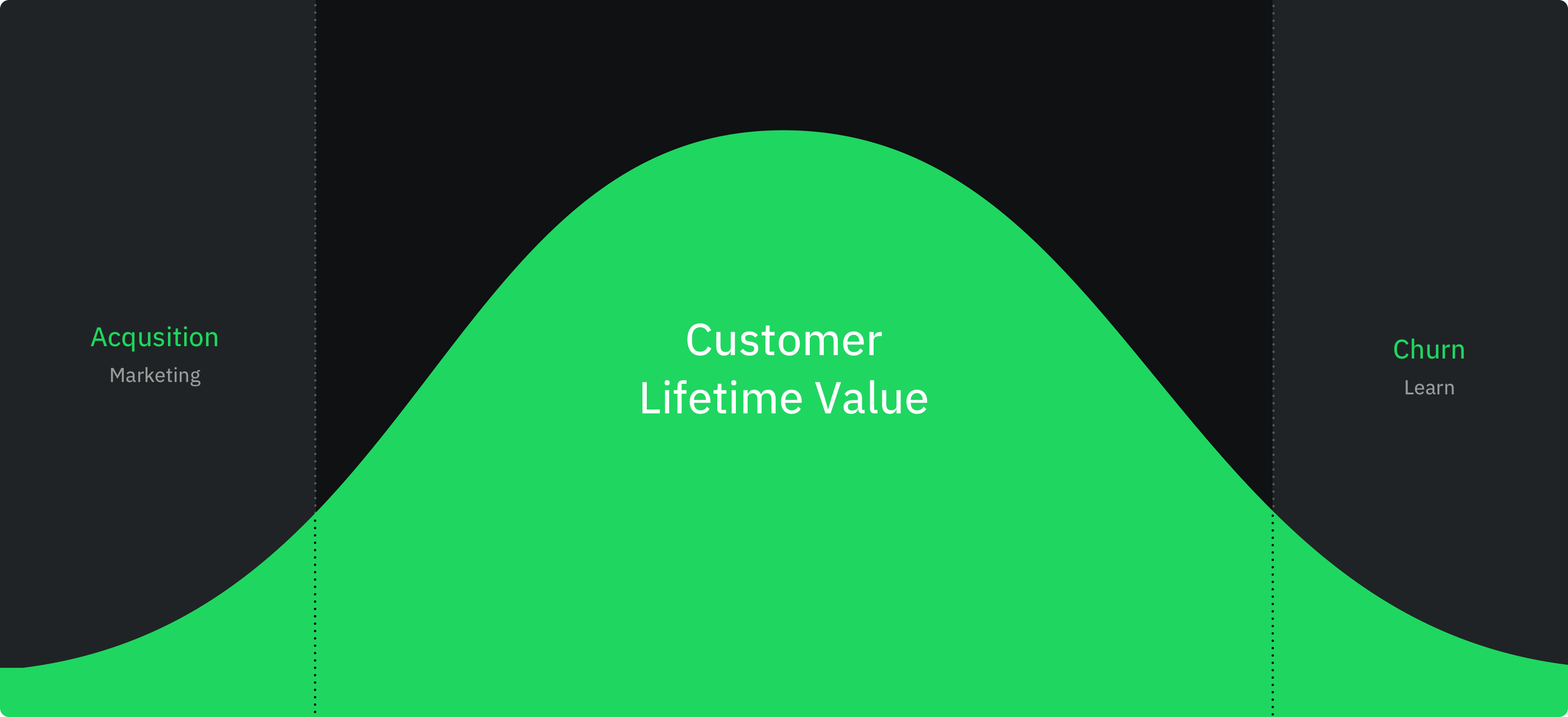
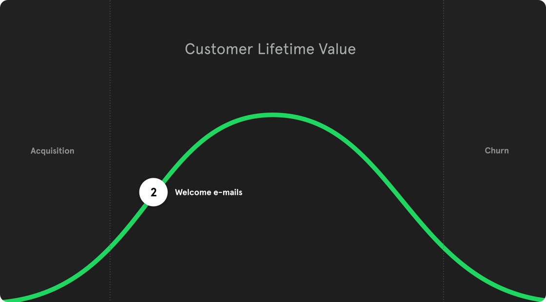
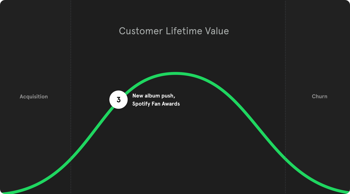
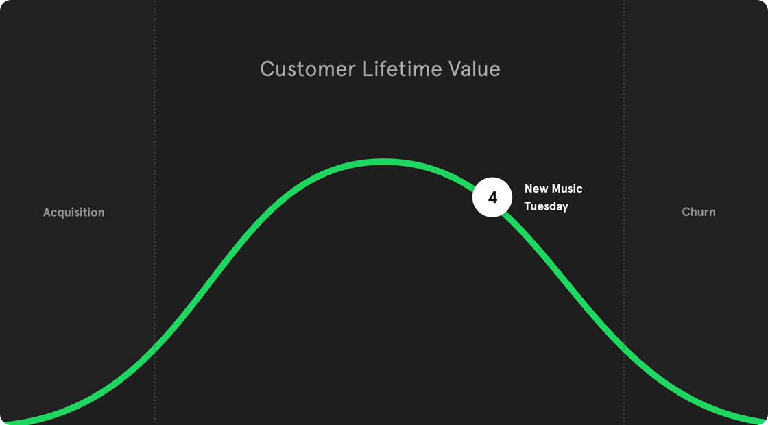
I worked at Spotify for six months doing design work for the Growth department. I learned so much in this time and was part of a lot of projects. I will try to present what I did on a customer lifetime value model. What the model does is to map out different things you can do to users who are in various stages of the customer journey. Users who are new to the product should get different messaging than users getting ready to leave. You want to keep as many users as possible at the top of the bell curve.
1.
Day One
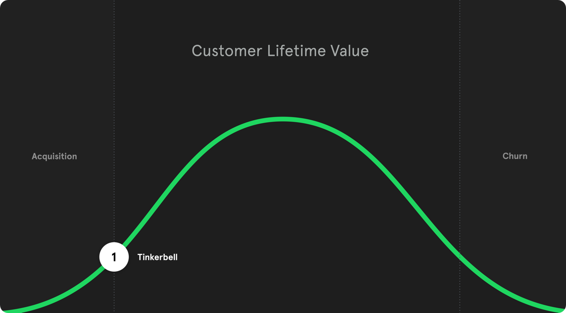
The very first day you use any app is a crucial one. We want to tell you everything that you can do while being careful not to give you information overload. For the in-app tutorial (nicknamed Tinkerbell), we focused on one thing: adding a song to your library, a simple action that illustrates the core experience of Spotify. We let the interface show you how to do it, and hopefully, you would mimic.
NB: Animations and visual design by my co-worker Sean Jamshidi.
Apologies for the crappy experience, this was the only solution that worked on both desktop and mobile :/
2.
Welcome e-mail
For telling users in the US about everything you could do with Spotify, we opted for e-mail. I did content strategy, and visual design for a total of 10 e-mails (if you start Premium trial) spread out over 14 days. There is a saying that creativity strives with confinements, and that is especially true with e-mail. There are many limitations to what you can do visually, but in the end, I was delighted with the results. We tested these e-mails on 10% of the users in the US and saw a small but significant uptake in user activity.
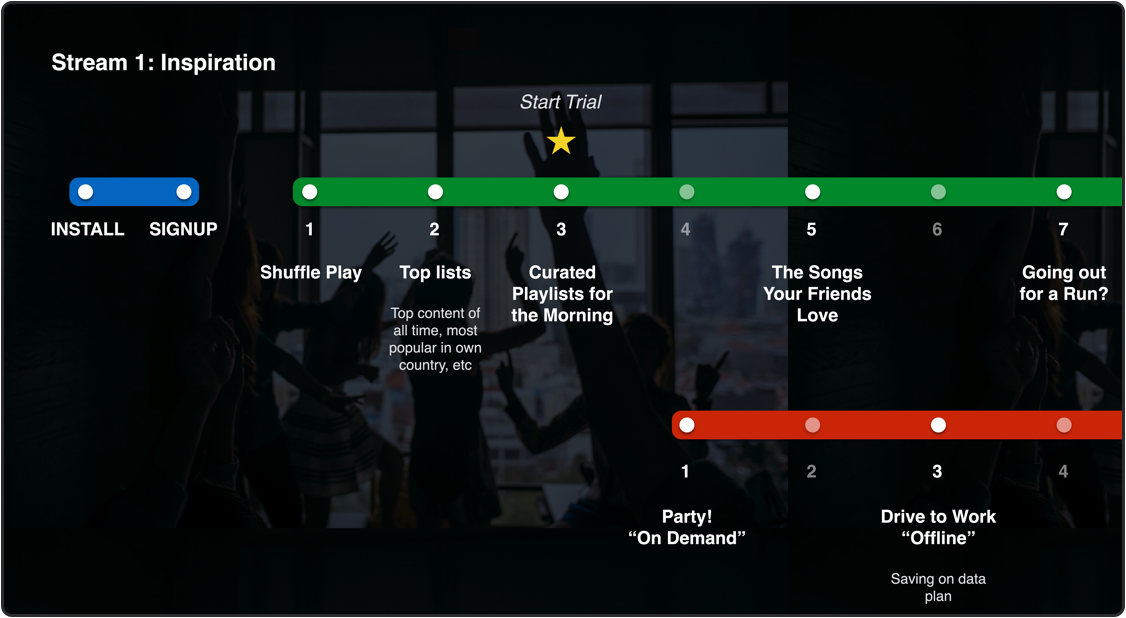
Release schedule for US onboarding e-mails

E-mail #3 "Mornings"

E-mail #3 "Mornings" (contd.)
3.
Activity push
Users who are on the platform and seem to be staying; the next step is to increase their usage. Our strategy was to do that by giving them more of the music they like. I designed the first "New album" modal that is still in the app today.
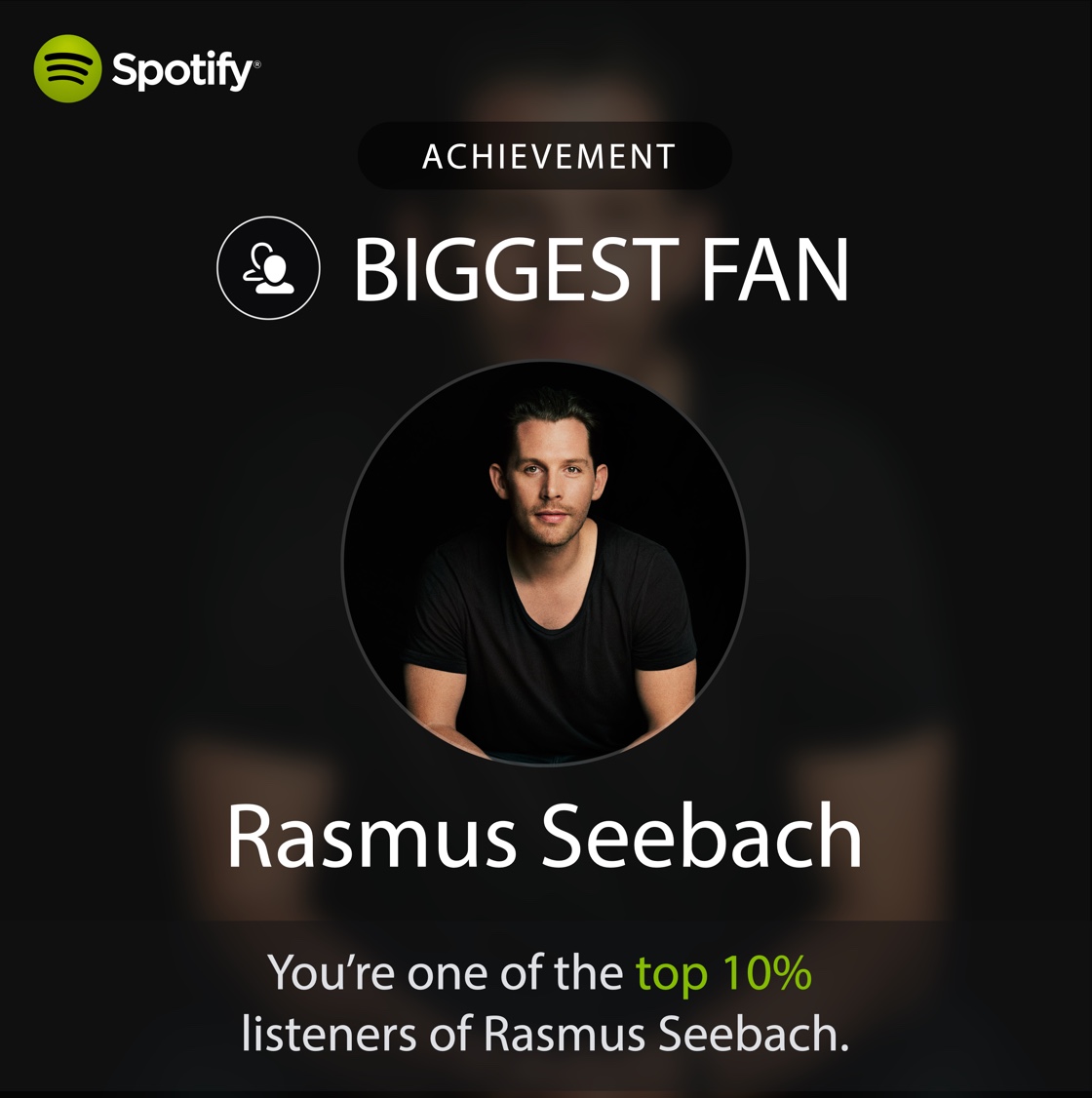
The feature I'm most proud of from my time at Spotify is 'Premium Awards' where we found the top listeners of selected artists and sent them video greetings from that artist. An MVP project in its essence. A team of two, a PM and I, came up with the idea, set up a mailing list with the data team, recorded the videos on our phones and then built an e-mail. We tried it out on the Nordic market, and at the moment it was the most opened e-mail in Spotify history. Sadly, this experiment never went into production.
Release schedule for US onboarding e-mails
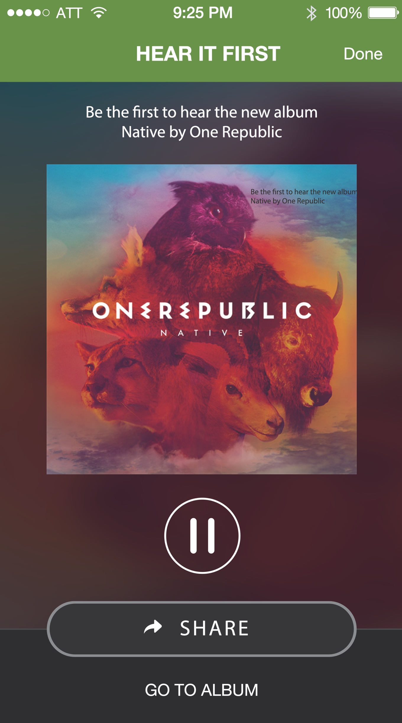
First version of "new release" modal that I designed
4.
Something new
When we notice that a user is slowly decreasing their use of the apps we naturally want to get them back to the highest usage levels. One way of doing that is to show them new music that they have not heard before. I designed one of the very first versions of the New Music Friday (note that it was on Tuesdays in the US back then, before Spotify made Fridays the day for all of the world). This modal was supposed to show for some users on Tuesdays. Notice that the CTA was 'Share' instead of play — at that time the growth teams main metric was shares. I did all the design, as well as motion. Initial tests of this feature was very positive but ultimately it reverted into a less obtrusive one.
Apologies for the crappy experience, this was the only solution that worked on both desktop and mobile :/
5.
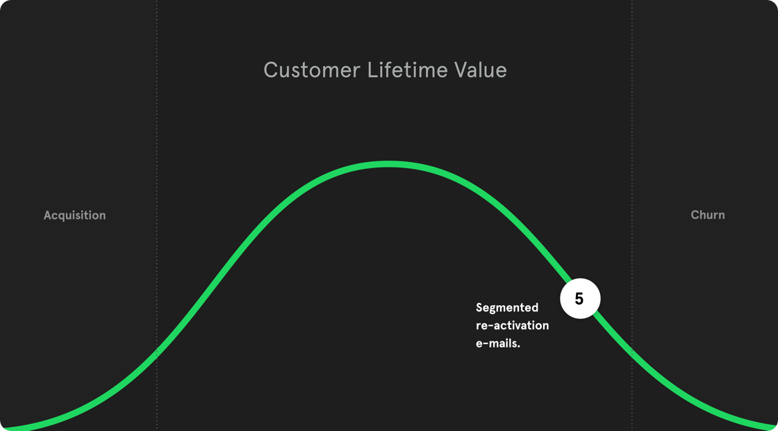
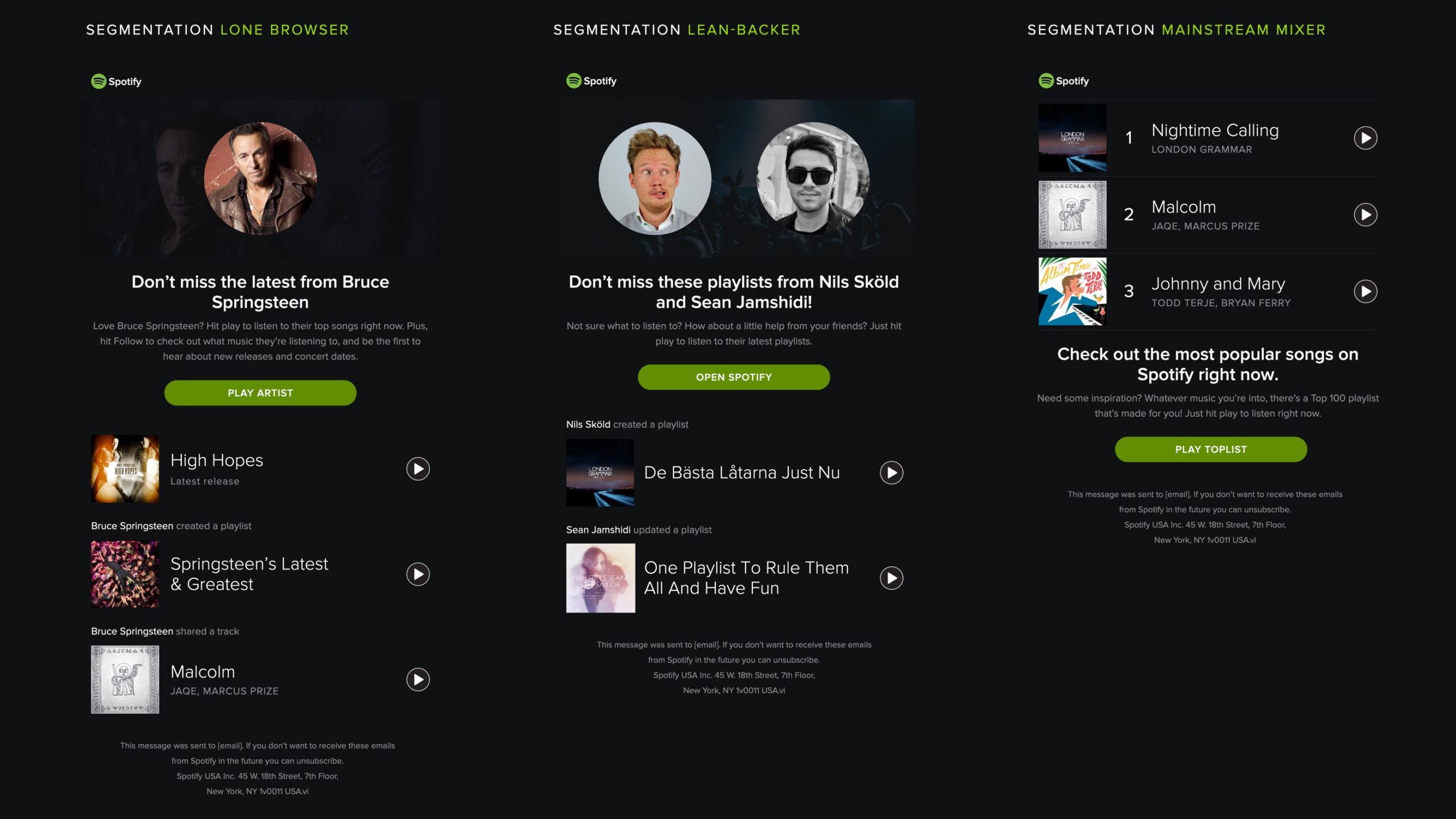
Re-activation
When a user is about to leave your service, you make one final try to reactivate them. Spotify has six distinct user segments, from casual listeners to trendsetters. We noticed that three segments were over-represented in churned users, so what we did was to create a personalised e-mail for each of those segments. Users that only listen to one artist got music and news from that artist. Users that only looks to friends playlists got updates from those playlists. Users that only listens to top lists got a list of the most popular songs from their country. I did concept and design, together with the data insights team.
