Lead Designer, Amuse
Work from 2018 until today
When I joined Amuse in 2018, we were 25 people, and I was the first design hire. My boss, co-founder and designer, had done everything from app design to album artworks up until then. Now I did those things :) A significant funding round was closed moments later, and we started to hire. Three months later, we were 50 people in the office, with five designers spread across different departments.
A year later, we reorganised into a more structured approach, moving all designers into one team, in the newly formed Experience department, handling every interaction with our customers. I was chosen to lead the design team and manage all designers. We now operate as an in-house agency, doing work for all parts of the company. However, we mostly decide on our own roadmap and work in separate sprints.
Re-design
2018
Web app
2019
Premium tier
2019
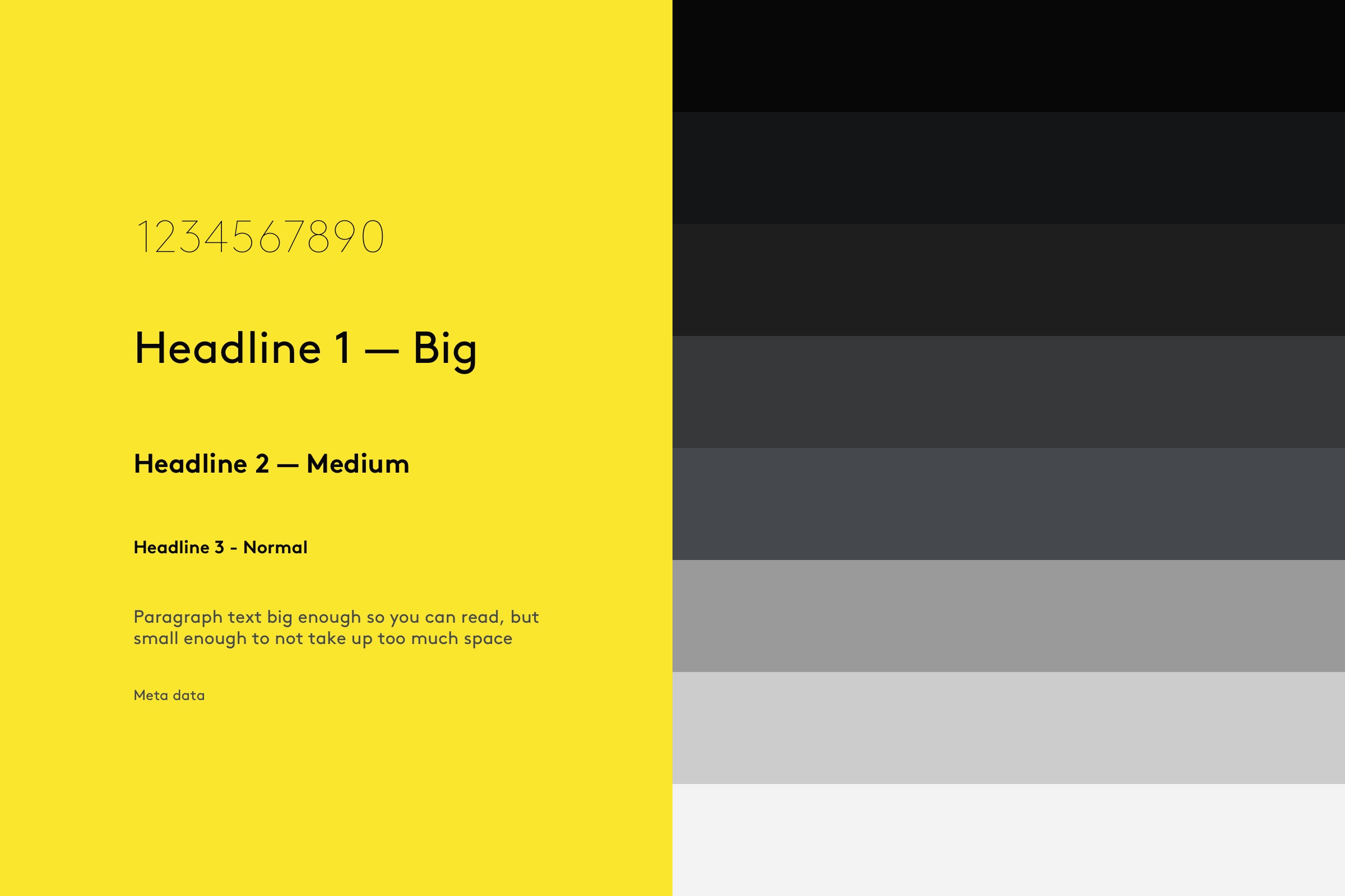
Design system
2020
Re-design
2018
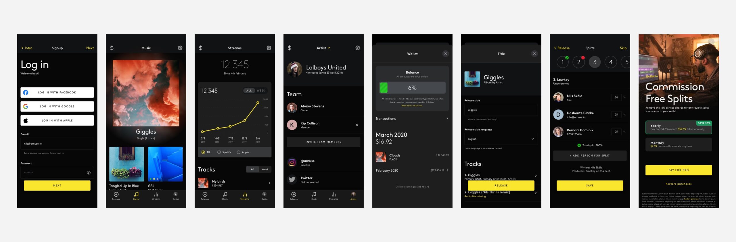
When I joined Amuse, as the first design hire in early 2018, we had an iPhone and an Android app, both were functioning but in a sort of MVP version. The original design was loosely based on a vertical timeline, where artists could see their progress. It looked as if the apps were designed for artists with a lot of releases, in many different states, who had millions of streams and highlights happening every week. The hypothesis was that this did not reflect our users, and we needed to change that.
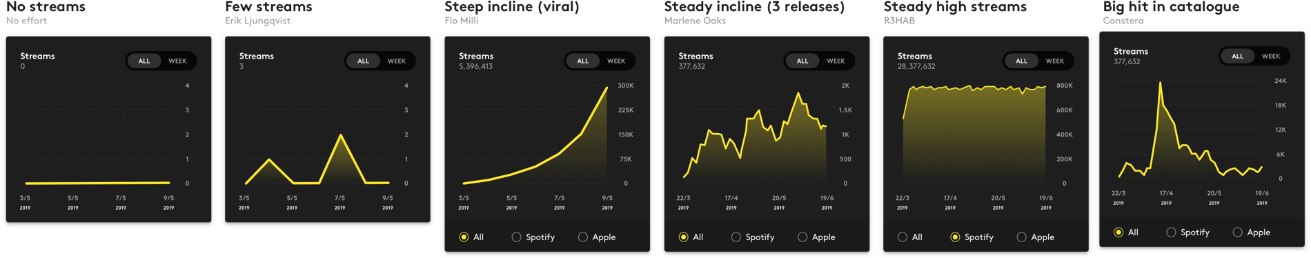
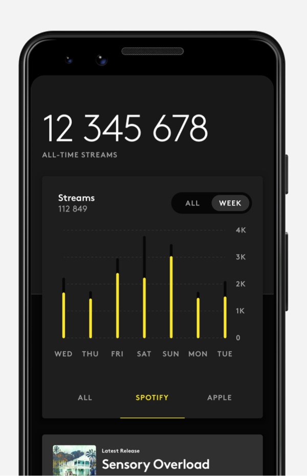
Different variations on graphs for the “streams” page
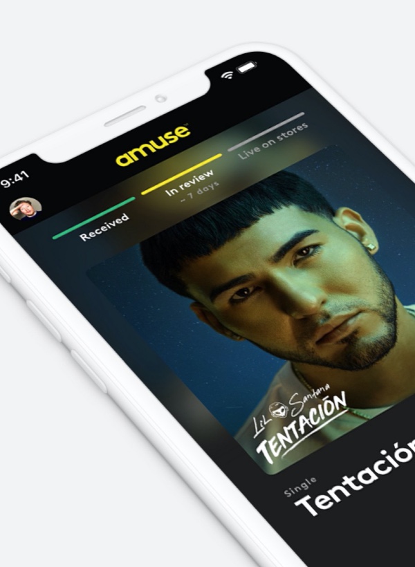
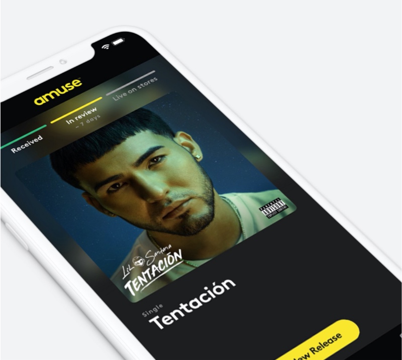
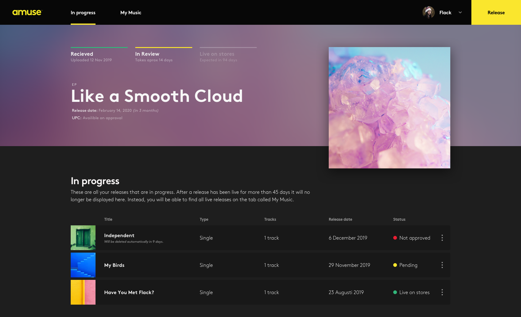
Display status on pending releases
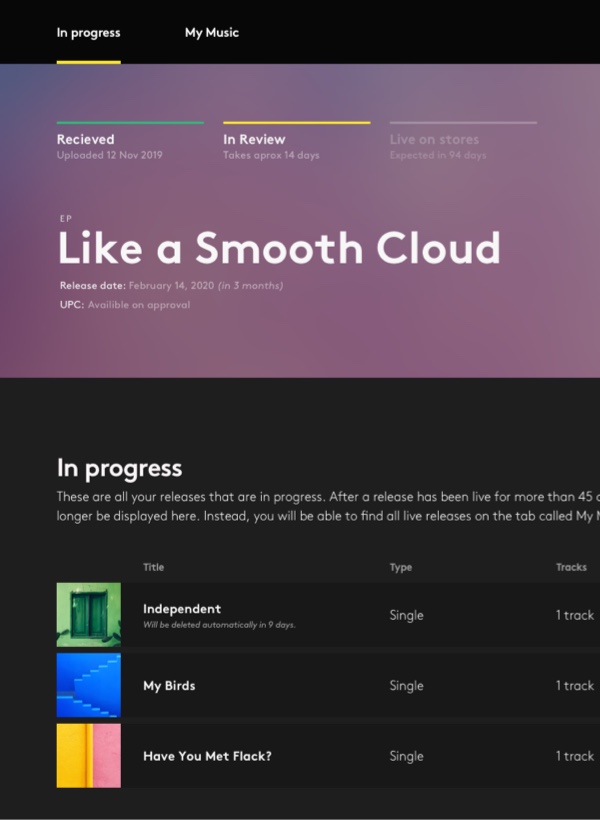
Goodbye lists, hello grid
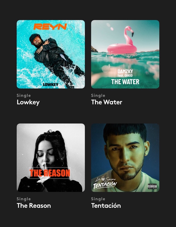
New design for page “streams”
After looking at data, and talking to artists, we concluded that it was in fact so. Most of our users had 2-3 releases with streams in their thousands. Our MVP system didn't have the functionality of milestones yet. You typically only released one new song every couple of months, and you spent a lot of time on not only the music but the artwork and everything around as well. With this, I set out to re-design the main pages of the apps: music, streams (then called Activity) and money.
How the app looked in 2018 when I joined Amuse
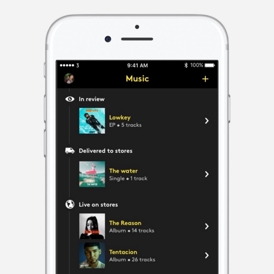
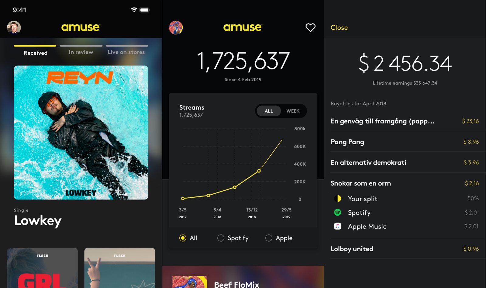
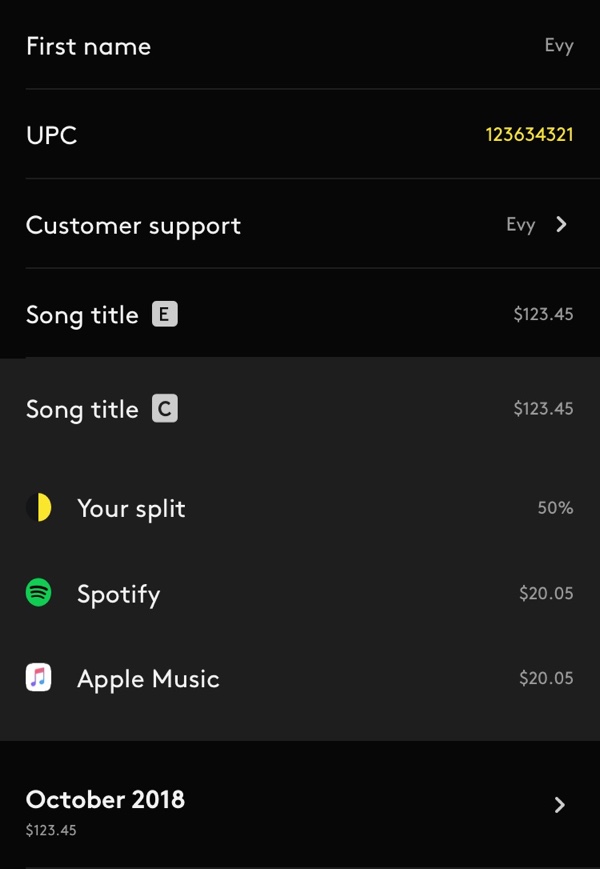
I made your latest release front and centre, with the current status clearly shown above the artwork. The design for the top card and the animation when clicking it was heavily influenced by the newly released Apple App Store. Instead of a list, your releases are now shown in a grid. I carried the big fullscreen card over to the streams tab and made a graph showing all time, and weekly listening data. I added an (All / Week) toggle to lists: top tracks and top countries. The Money tab got a cleaner look and was changed to sort on songs instead of the service provider (Spotify, Apple, etc.)
Web app
2019
When we asked users what feature they most wanted, almost all of them said to release on the web. In hindsight it's apparent, but at the time this was debated heavily internally as we had branded ourselves as the world's only mobile music company. Today our three platforms: iPhone, Android and web are all equal in size in terms of uploaded releases and active users. This was a fast project. From the day we made the decision to build it, it only took 3 months until it shipped. While not ideal, we started designing and building at the same time.
My role in this project was more as a creative director, where most of the day-to-day design was done by Evy. We worked in 2-week sprints with planning on the first Monday, and demo on the last Friday. Tuesday and Thursday afternoons were for design stand-ups where I looked at the design and gave feedback. We didn't ask for input on demos but instead had separate feedback sessions with stakeholders and developers, where we showed more in-progress work.
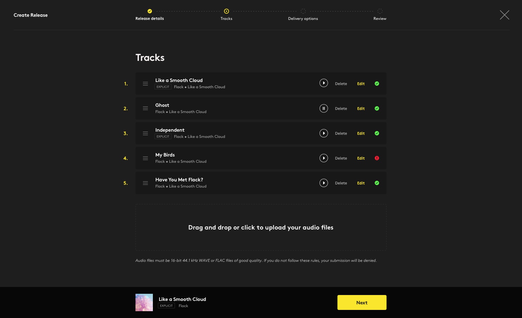
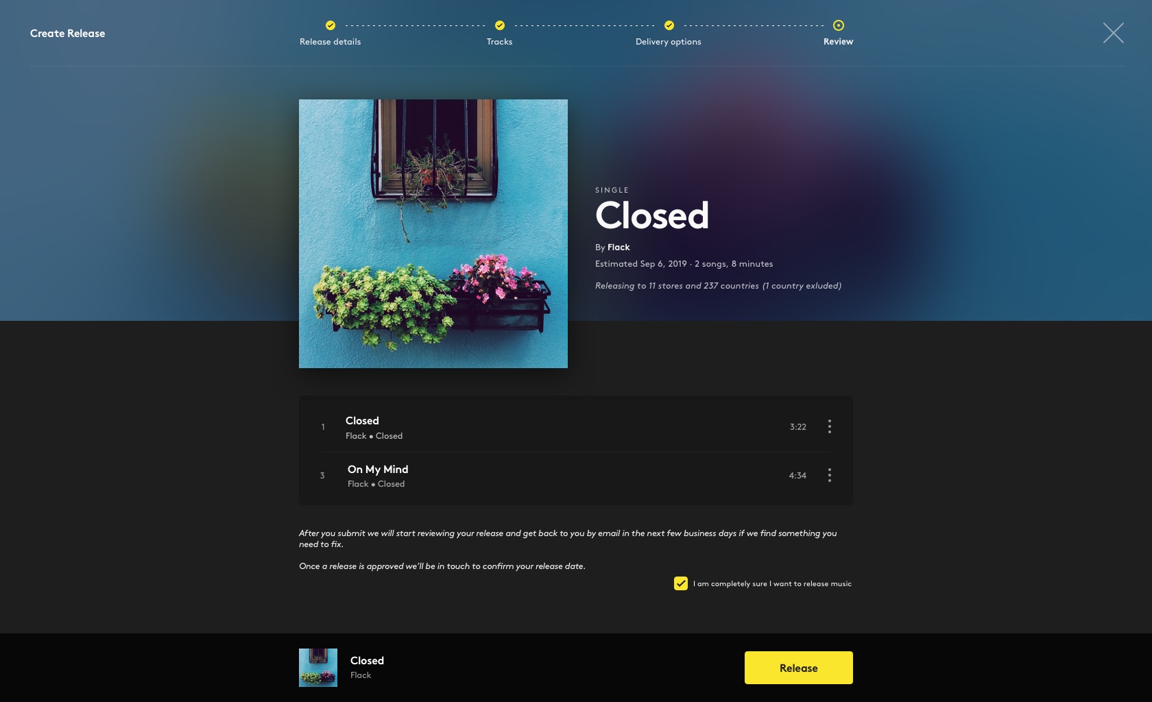
We decided to base most of the design on our mobile apps and skip Money and Streams to save time. We wanted to borrow visual elements from both mobile platforms: the big artwork grid from Android, and the subtle blur from iPhone. We did one significant change to the release builder: divide it into more steps: release info, track by track, distribution info and then a summary before you submitted. It was small changes but made a huge impact.
We also separated releases in progress from ones that were live. This turned out to be a mistake. At the moment we were planning to build both drafts and a tool for moving your catalogue from other services to us. It made sense to have one page for releases in progress and drafts on one page, and a way to move already live albums on another page. However, the roadmap changed, and none of those projects became a reality, so we are stuck with a weird web service for a year. Lesson learned.
Premium tier
2019
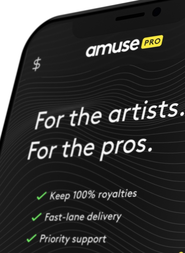
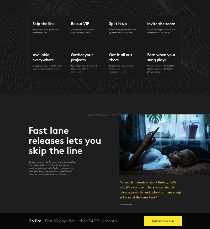
During summer 2019 it was decided that Amuse was launching a premium tier in the first months of 2020. We had six months to design, build and communicate a completely new product that required a new business model, and a complete build-up of our underlying systems. After a genuine team effort, Amuse Pro had its first paying customer in March 2020. I led the concept and design strategy project for Pro (called Premium at the time), as well as designed most of the critical functions for mobile.
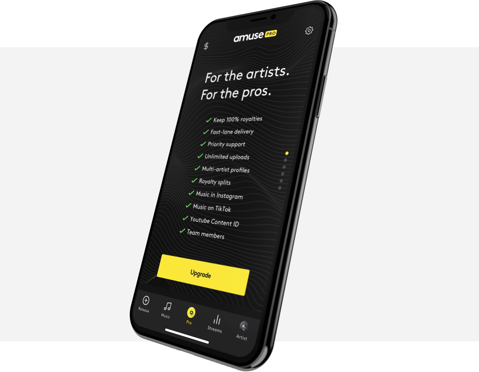
Three product designers worked full time on this project for four months. With one month for strategy and branding, one month for concept and structure and two months for detailed visual design. Sometimes we worked on different parts of the same feature, some times we all did the same functionality but took one platform each. The key concept was to make Pro features visible for everyone, seamlessly integrated into the existing product. A little Pro badge indicated that it was a paid feature, and while trying to activate it, you are greeted with a modal asking you to subscribe.
Pro tab
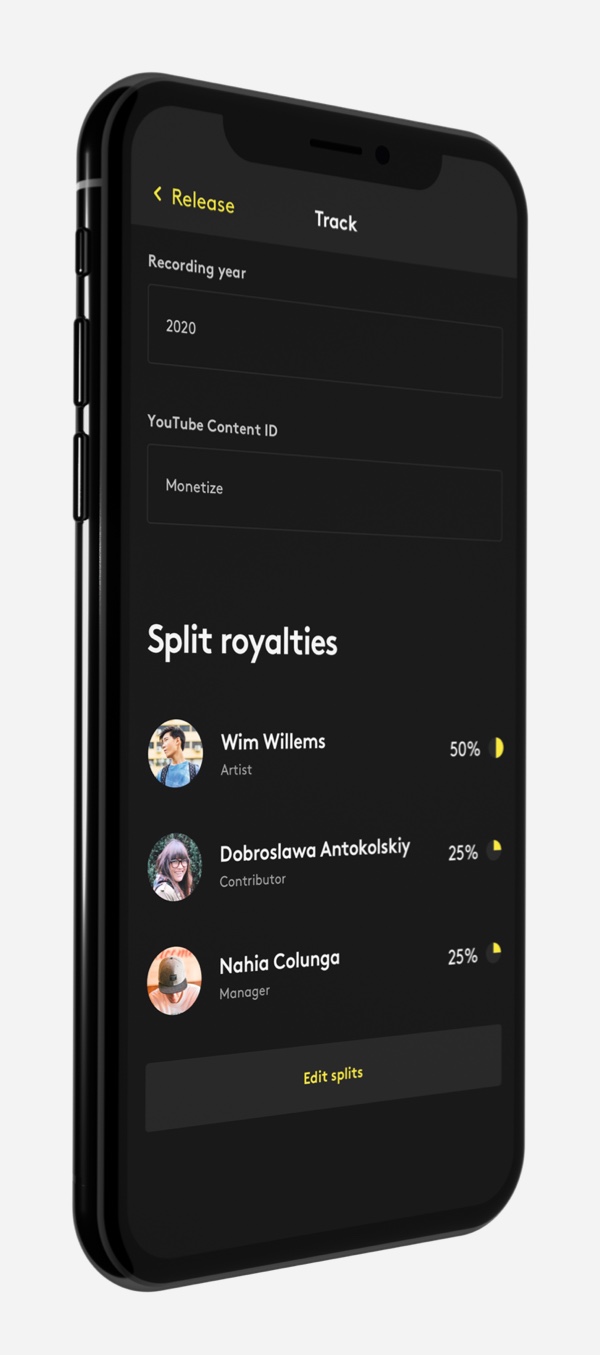
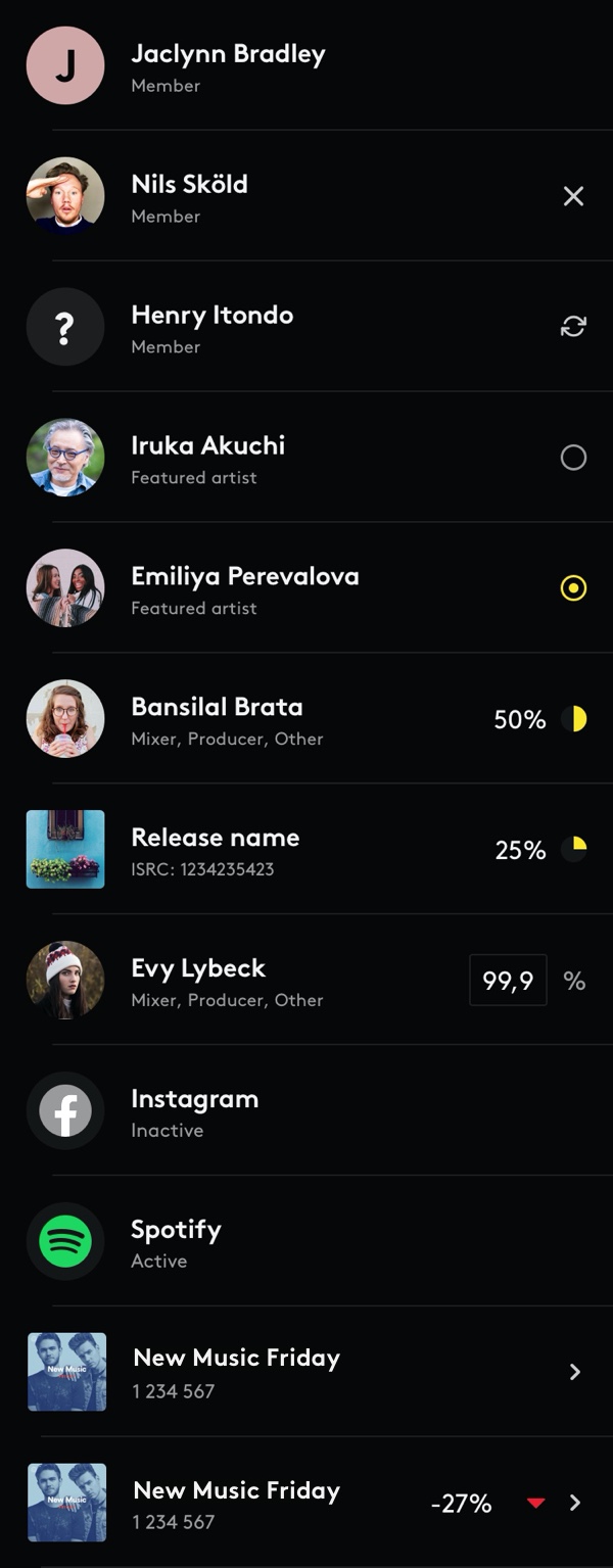
Royalty splits
Artist switcher
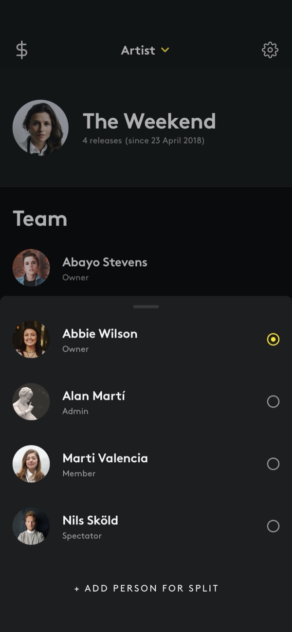
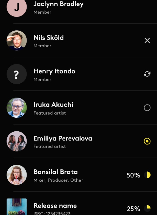
The two main features of Pro are Royalty Splits and Teams. Both are features where you interact with other people. This is a new thing for Amuse, like the rest of the app is all about meta-data (artists, writers, producers, etc. are not "real" entities, but pseudonyms and middle-men). We spent a lot of time making royalty splits and user permissions as easy and natural as possible. They are both very complicated, complex and unnatural features that generally require a lot of explanations. Most of our users aren't interested in reading descriptions. Instagram was a huge inspiration for account handling and switching between artist profiles.
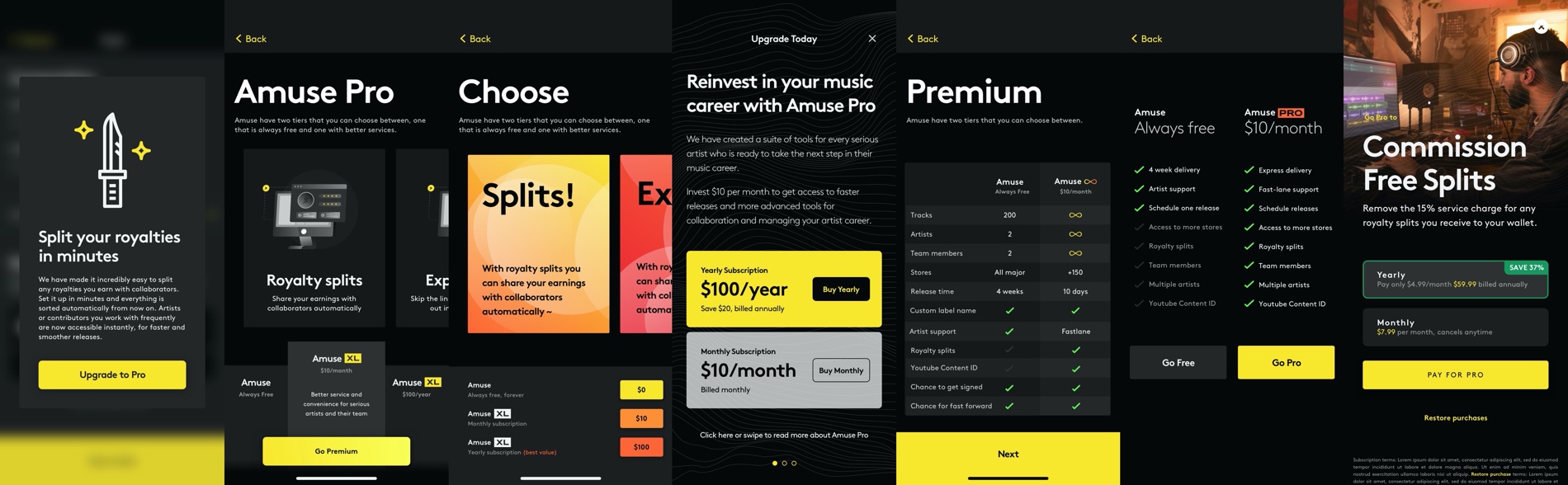
Design explorations for the paywall screen for Pro
Design system
2020
Working at a startup means only doing short-term solutions. That is the nature of the business, so we do it, but your products take a toll. Both visually and in interaction. After three years of three different designers doing projects which primarily solved the short-term problem at hand, our platforms were all over the place. When designing a solution, the quickest and easiest way is to just solve that problem, not think of everything else. So we did. Some functions were totally custom, some were native to the platform, most were a mix. Three-year-old screens were next to three weeks old ones. We needed a universal system, to base all product design on going forward. Amuse product design system was born.
We started with an audit: go through every screen of every product, and list out all functions. Then we grouped them and compared between platforms. With the overview we got from the audit, we listed all the key screens of the product and re-created them with the smallest set of functions we could use. From having 5 different buttons, we now only used two. With the key screens done, we basically had a completely re-designed app and a manageable number of functions. Next step was making symbols of these functions in our Sketch file, sweating the details, order of editable objects, making them all pixel perfect. Finally, after 3 months of having this as a side-project, we documented the system in Google Slides and started using only those functions in future designs.
Screenshot of iPhone audit
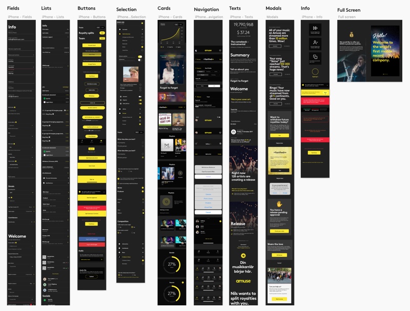
Screenshot of Android audit
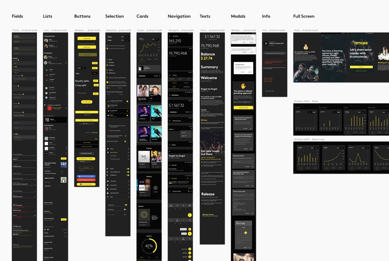
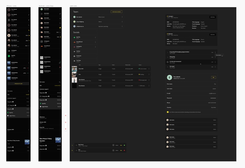
Lists items for all 3 platforms
I was design lead on this project. I worked one step ahead of the rest of the group. So first I did the audit for iPhone, then showed the group so that they could do it for Android and Web. When all was done, I reviewed the work and went through it in detail as a group to take away learnings. Then I recreated the primary screens on iPhone, showed it to the group and let them duplicate it again on the other platform. This was an efficient way for me to stumble on most pitfalls, and learning how to do it first, then teaching the team how to do it best. The review was primarily going through every detail and highlighting any mistakes that might have been done. Still, I also gathered the group for every step to go through the design principles to make sure they were being followed (or updated).
The visual product design system is done and will be built in steps during this year. The next step for us designers is to look at the written design, we will launch a UX writing project this summer. When done, the plan is to look at our animation language and create a system on that.
List items: navigation ands tracks (wallet)
List items: artists and users and tracks (streams)
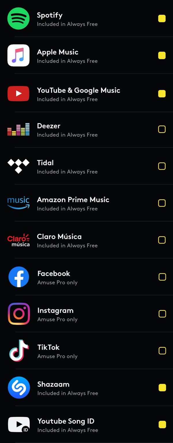
List items: music stores and streaming platforms


When reviewing all assets, I realised that our app icon and logo symbol could do with a small update, so I quietly removed the shadow from inside the A and updated it on both iPhone and Android. No one has noticed it, but for me, it's a vast improvement.